A to-do app built around one note at a time.
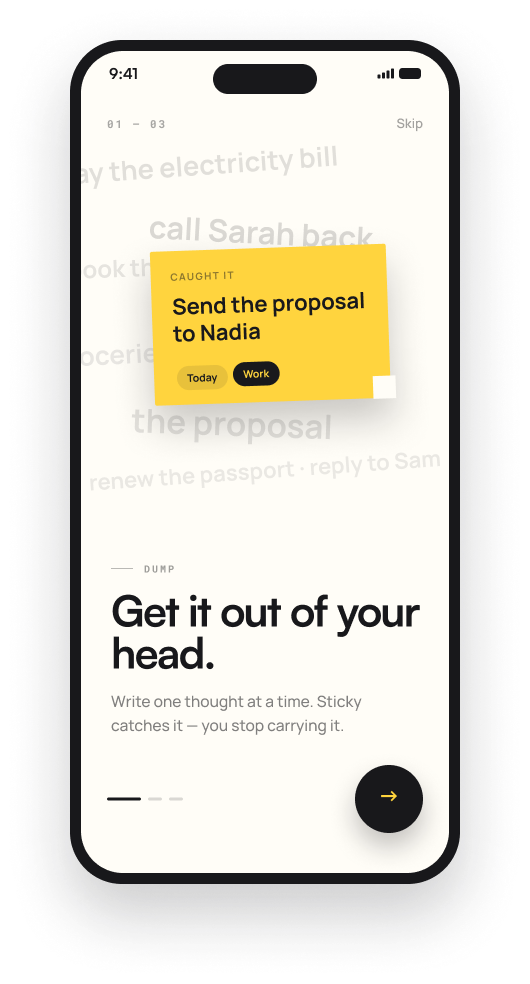
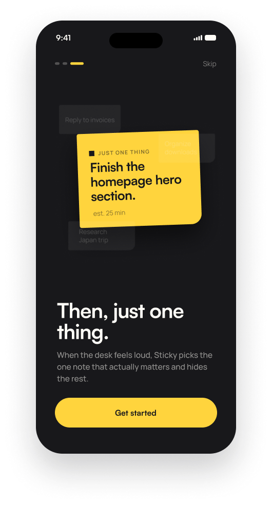
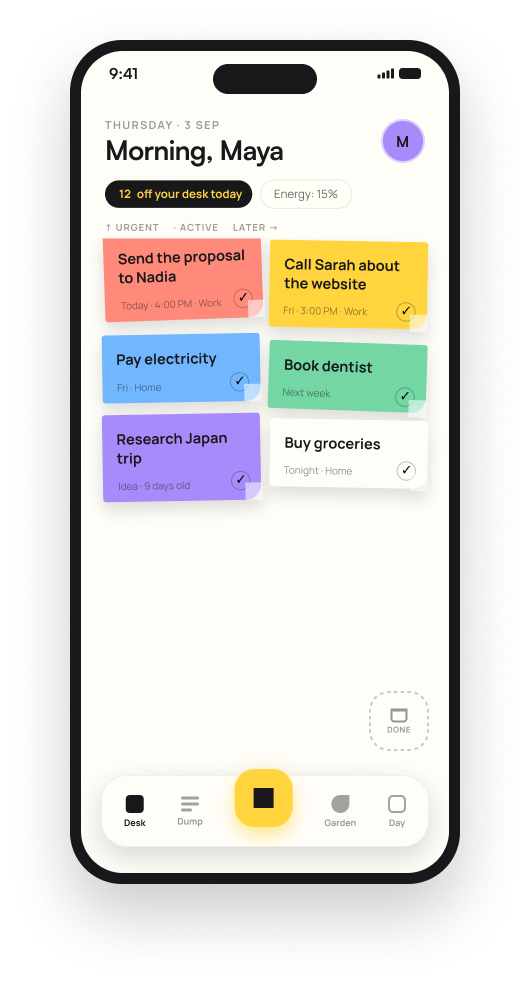
I designed Sticky solo: a task app built entirely around the physical sticky-note metaphor, made to fix what I found frustrating in existing to-do apps and built to be something I could actually share with friends and family, not just use alone.
Backlogs or badges, pick your poison
To-do apps tend to fail in one of two directions. They let lists grow into an overwhelming, guilt-inducing backlog, or they lean on gamification, streaks, badges and points, which turns getting things done into a performance instead of just doing them. Neither actually matches how a sticky note works in real life: you write it, you look at it, you do the thing, you throw it away.
Picture someone who has tried several to-do apps, each abandoned after a few weeks once the backlog got long enough to feel bad about, or once the streak-tracking started to feel more like pressure than help. Sticky's starting point was that frustration, plus wanting something simple enough that a partner or roommate could actually use it too.
Light enough to keep, shared enough to matter
This was a personal-experience-driven project, not a formally researched one. The frustration with existing to-do apps and the desire for something shareable with people close to me were the actual triggers.
Solo, and clear about the research
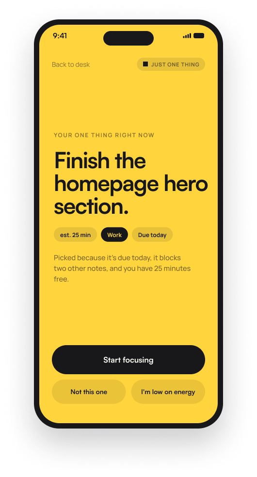
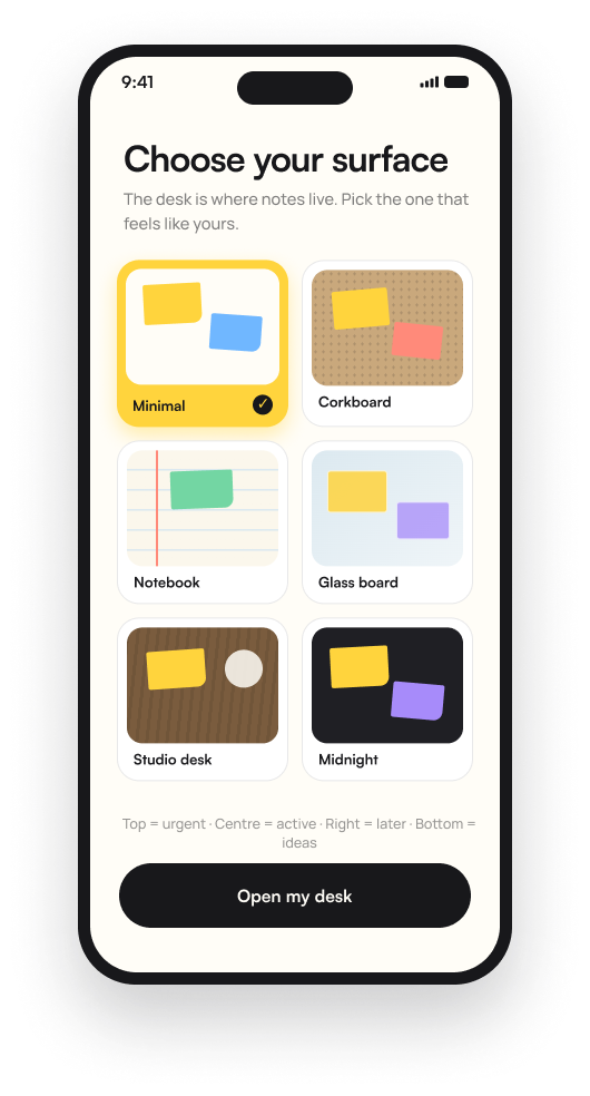
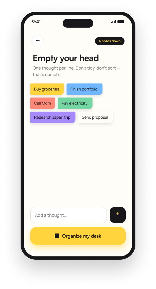
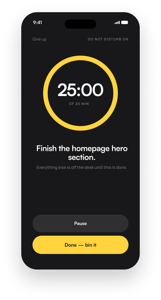
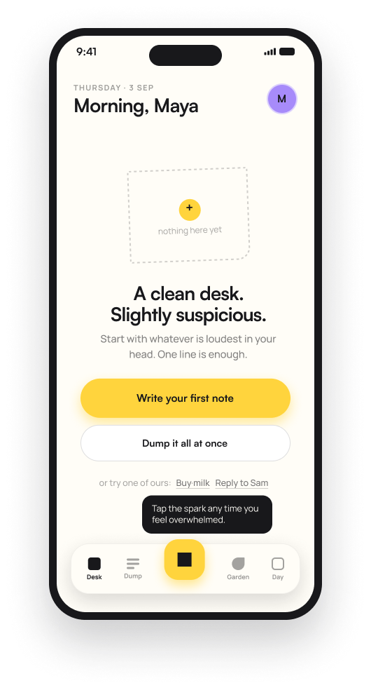
I designed Sticky solo, end to end: the desk and notes metaphor, voice capture, focus mode, calendar view, shared households and the Watch companion.
Because this is a personal project, the design is grounded in my own frustration with existing to-do apps rather than formal user research, and there is no user testing yet since the app is still in development.
Fidelity to the metaphor
Hypothesis: if tasks behaved like physical sticky notes, written quickly, visually distinct, meant to be cleared rather than accumulated, and the app avoided gamified pressure entirely, people would actually keep using it, alone or with the people they share tasks with.
The guiding principle was fidelity to the sticky-note metaphor itself. Every feature had to make sense as a note on a desk before it was allowed into the app, which kept the scope disciplined and the interaction model consistent.
The Watch shows exactly one task
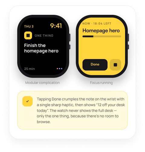
Most task-app watch complications either show a mini version of the full list or a vague summary, giving you the same overwhelm in a smaller space.
I designed the Watch complication to show exactly one task at a time, with a single Done action. Completing it doesn't reveal the next item automatically; the note simply crumples with a haptic, reinforcing that this was the one thing, not an entry point into a list.
A watch screen is too small to browse a list well, so I didn't try to make it one. Constraining it to a single task turns a technical limitation into the actual point of the feature: total focus, enforced by the hardware itself.
The Watch became the purest expression of the one thing idea in the whole app, rather than a cramped, compromised version of the phone experience.
Voice dumps split into separate notes
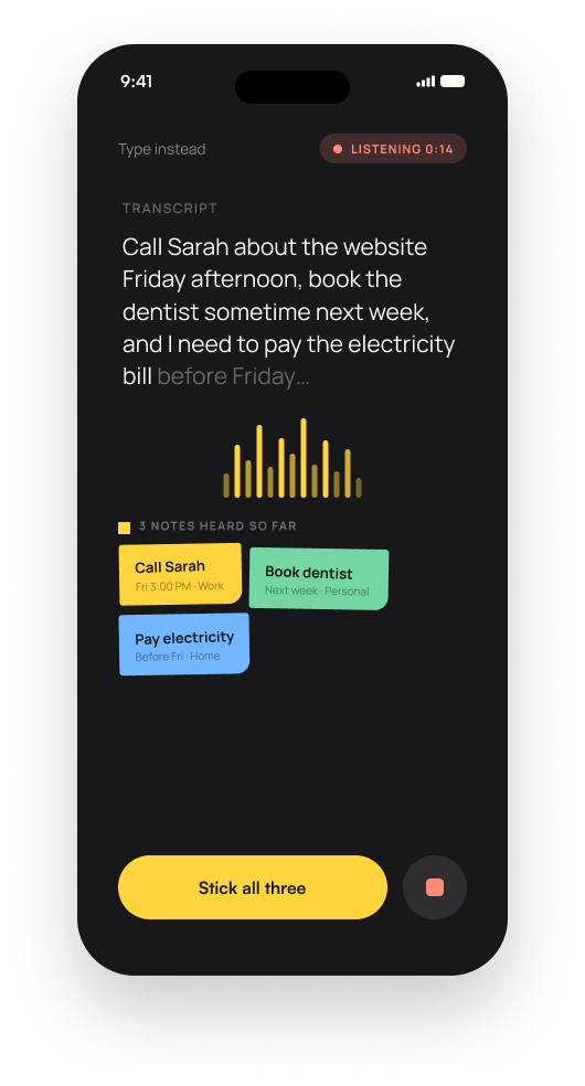
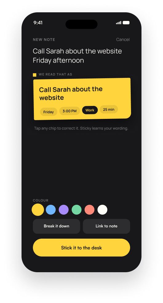
People naturally think out loud in run-on sentences, call Sarah about the website, book the dentist next week, pay the electricity bill before Friday, but most voice-to-task features either transcribe it as one blob or require manual splitting.
I designed the Dump feature to transcribe a rambling voice note live and automatically split it into distinct, color-coded notes as it listens: three separate tasks recognized and shown separately, with a single Stick all three action to commit them at once.
The whole value of a quick voice dump is not having to stop and organize while you are talking. Automatically splitting run-on speech removes the one step that would otherwise force you back into manual organizing, the exact friction the feature exists to avoid.
Capturing several tasks became as fast as talking for fifteen seconds, with the app doing the organizing work instead of the user.
A tiered backlog import
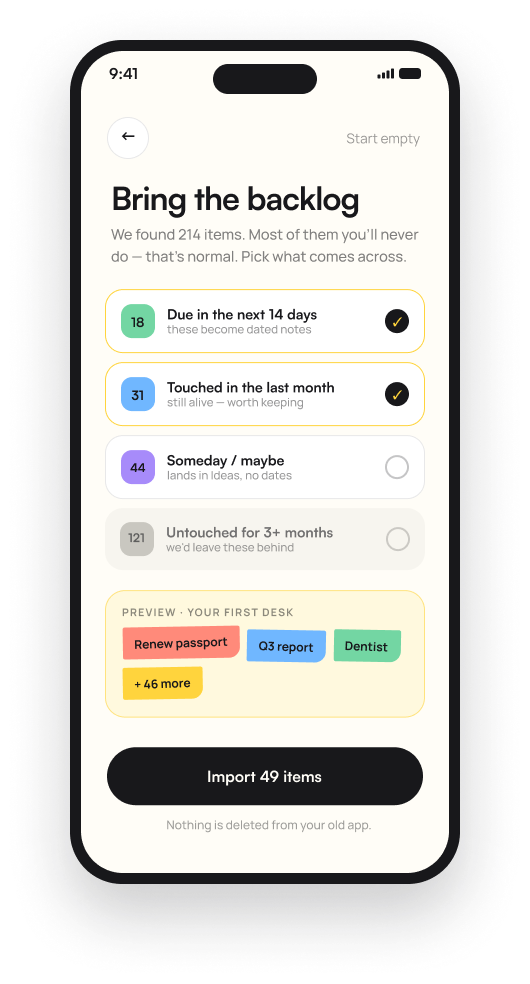
Someone migrating from another to-do app often has a bloated backlog: old, abandoned, half-relevant items that would immediately recreate the overwhelm Sticky is designed to avoid.
I designed the import flow to bucket old items into tiers, due in the next 14 days, touched in the last month, someday or maybe, and untouched for three months or more, with the first two pre-selected and the stale tiers left for the user to opt into deliberately.
Importing everything by default would import the exact problem the app is trying to solve. Bucketing by recency and relevance lets someone start with a genuinely usable desk, while being honest that nothing is deleted, it is just not automatically brought along.
Migrating to Sticky became an active, honest decision about what is actually still relevant, rather than a wholesale copy of an already overwhelming list.
A shared desk with unclaimed notes
Shared task apps for households often either force rigid task assignment upfront or don't handle shared responsibility well at all.
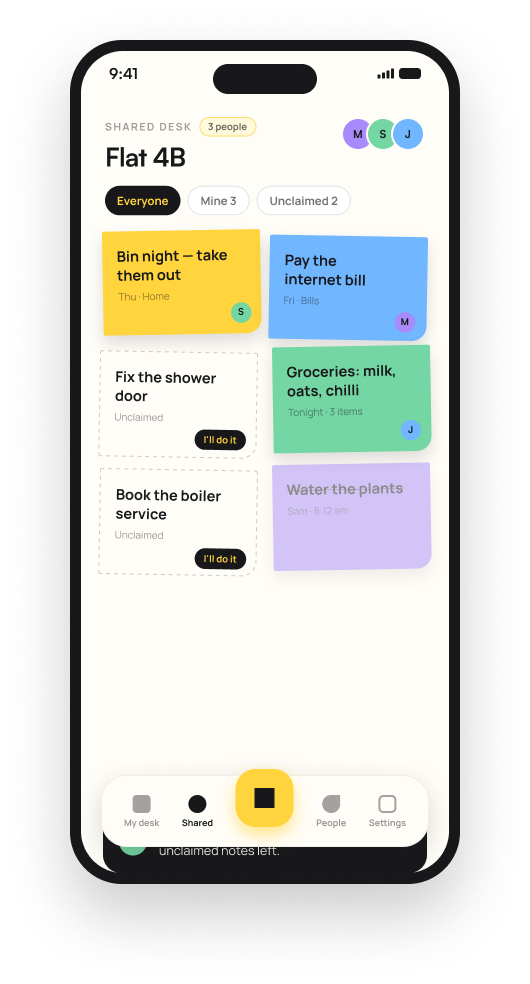
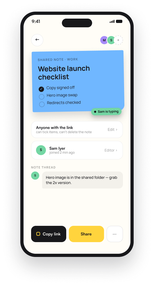
I designed a shared desk for households where notes can be posted unclaimed, visible to everyone and claimable by anyone via an I'll do it action, alongside notes already assigned to a specific person, with live typing indicators and threaded notes on shared items.
A lot of household tasks don't have a natural owner until someone decides to take them. Fix the shower door doesn't need to be pre-assigned, it needs to be visible until someone claims it. Forcing assignment upfront doesn't match how shared responsibility actually works day to day.
The shared desk supported the messier, more realistic way households actually divide tasks, instead of forcing a rigid assignment structure onto it.
Anti-gamification nudges, and notes that age
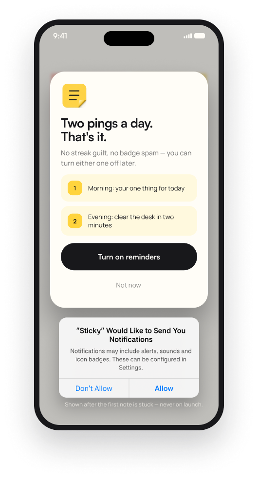
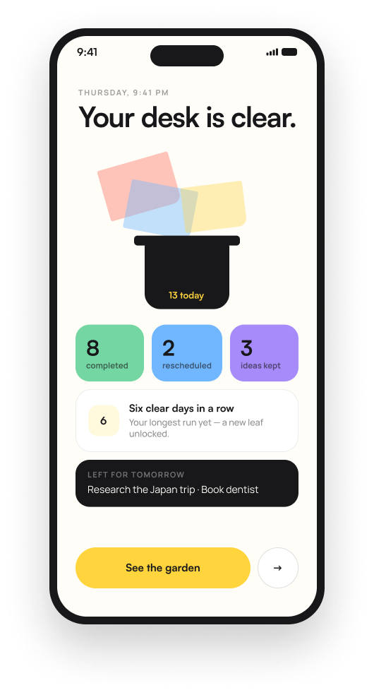
Streaks, badges and points are common in to-do apps, but they turn task completion into a performance and create their own guilt when a streak breaks.
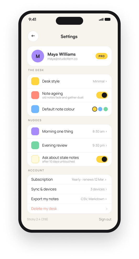
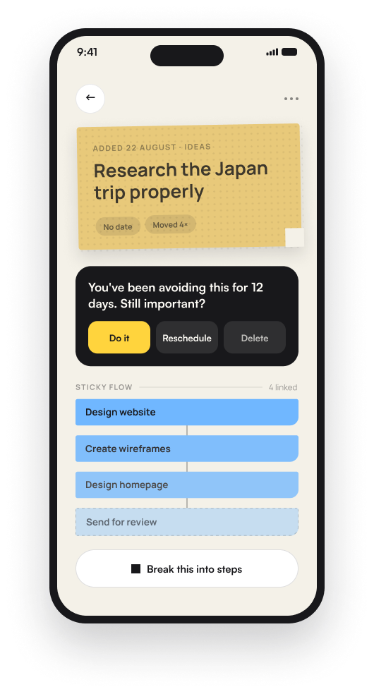
I designed notifications around exactly two daily pings, a morning one thing prompt and an evening review, explicitly framed as no streak guilt and no badge spam, with both toggleable. I also designed a note ageing setting where old, untouched notes visibly fade and gather dust rather than sitting unchanged in a list.
Gamification mechanics optimize for engagement, not for actually feeling good about getting things done. Two honest, low-pressure nudges respect the user's attention instead of exploiting it, and a visibly ageing note communicates neglect the way a real note yellowing on a desk would: informative, not punishing.
The app's relationship with the user shifted from keep your streak alive to here's what is actually going stale, which is a fundamentally gentler kind of pressure.
One filter, every screen
As a solo project, I designed every part of Sticky myself: the desk metaphor, voice capture, focus mode, calendar, shared households, settings and the Watch companion, without a team to divide the work across.
The consistency of the sticky-note metaphor across every screen was easier to maintain solo, since every design decision passed through the same filter: does this feel like a note on a desk.
Honest about what exists
Sticky is still in development, with no public release yet.
I don't have hard data, since there is no shipped product to measure. Early, informal reactions from friends and family who have seen or tried early versions have been positive, particularly around the shared household desk and the anti-gamification approach. I state that directionally, not as a measured result.
This project pushed me to hold a single metaphor disciplined across very different contexts, a phone screen, a watch face, a shared household view, a voice interface, without letting any one feature drift away from this is a sticky note just because a screen made something else convenient.
A metaphor is a constraint
The clearest lesson from this project so far is that a strong physical metaphor is also a useful design constraint. Every time I was tempted to add a feature that didn't behave like a note on a desk, that was usually a sign it didn't belong in this app, even if it is common in other to-do apps.
Since there is no real usage data yet, the honest next step is testing with actual households, not just friends giving informal reactions, particularly around the shared desk and the tiered backlog import, since both depend on real, messy, existing task lists to prove out.