
Designing one home for a household's grocery routine.
I designed and prototyped PantryPal end to end, solo, to bring pantry tracking, shopping and meal planning into a single connected app instead of three disconnected habits.
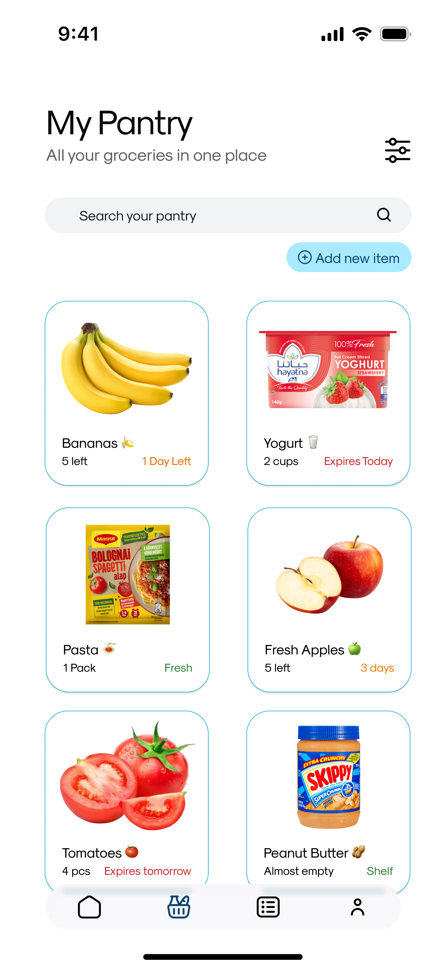
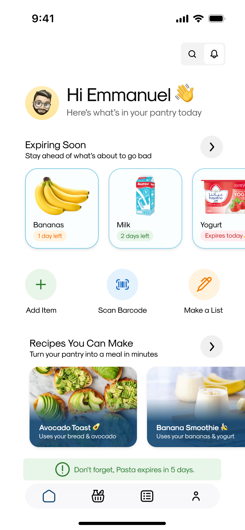
Three habits, three separate tools
Grocery management usually breaks down into three separate habits: keeping track of what's in the fridge or cupboard, deciding what to buy, and figuring out what to cook. Most tools solve exactly one of these. A shopping list app doesn't know what's already at home. A recipe app doesn't know what's about to expire.
Picture someone opening the fridge on a Tuesday evening, staring at half a bag of spinach and a carton of yogurt, with no clear read on what's expiring, what's already been used for meals this week, or whether it's worth another grocery run. That moment is what PantryPal is built around.
Three things had to be true
For PantryPal to be worth building instead of just another list app, all three of these had to hold:
Solo, and honest about the research
I worked solo across the full process: problem framing, wireframes, UI, and a high-fidelity interactive prototype.
Because this was a personal project, the research behind it was grounded in my own experience managing a household pantry, along with a review of existing grocery, pantry and recipe apps to see where they fell short. I didn't run formal user interviews, and I'm calling that out directly rather than implying otherwise, it shaped a few of the decisions below, particularly where I chose to keep scope narrow rather than validate against user data I didn't have.
A proto-persona, labelled as one
Since there was no formal research phase, I built a proto-persona from personal experience and competitor review rather than interviews, I'm labelling it as exactly that, not as validated research.
Amara, the household grocery coordinator, shares a home with two others and does most of the shopping and cooking. She checks the fridge out of habit rather than any system. She wants to stop throwing out food that quietly expired, stop buying duplicates, and decide dinner faster on weeknights. Her mental list falls apart the moment a housemate buys or uses something without telling her, and recipe apps never account for what's actually in her kitchen. She's comfortable with apps but has low patience for heavy manual upkeep, she'll abandon a tracker if logging items feels like a chore.
The five decisions below are designed for someone managing a shared, moving target of a pantry, not a single person with a static shopping list.
One connected loop, not one strong tool
Hypothesis: if pantry tracking, shopping and meal planning shared the same data, people could make faster, less wasteful grocery decisions, because they'd never be reasoning about what's in the kitchen from memory alone.
The guiding principle was to build one connected loop, know what you have, know what you need, know what you can make, rather than a strong tool for any single step. That meant some individually impressive features, like receipt scanning, were left out if they didn't directly serve that loop in v1.
One app, not three
Pantry tracking, shopping lists and recipe discovery are usually separate tools, each solving one part of the same underlying routine.
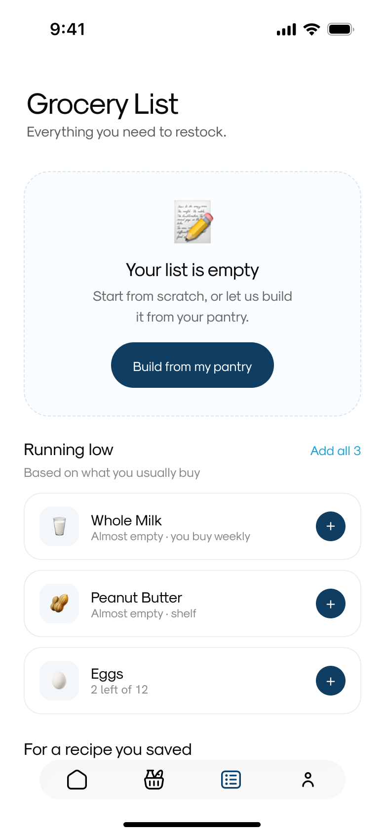
I combined all three into a single data model, the same pantry inventory drives what shows up as expiring soon, what gets suggested on the shopping list, and which recipes get recommended.
I considered building just an inventory tracker first and adding the rest later. But the value of tracking a pantry is almost entirely in what it enables downstream: better shopping, less waste, easier meal decisions. A standalone tracker without that connective tissue would have solved a smaller, less interesting problem.
Every other decision in this project follows from this one, it's why the shopping list can suggest items from low stock, and why recipes can be filtered by what's already on hand.
Two ways to add an item, on purpose
Adding items is the highest-friction, highest-frequency action in the app. If it's slow, the whole pantry goes stale, literally and functionally.
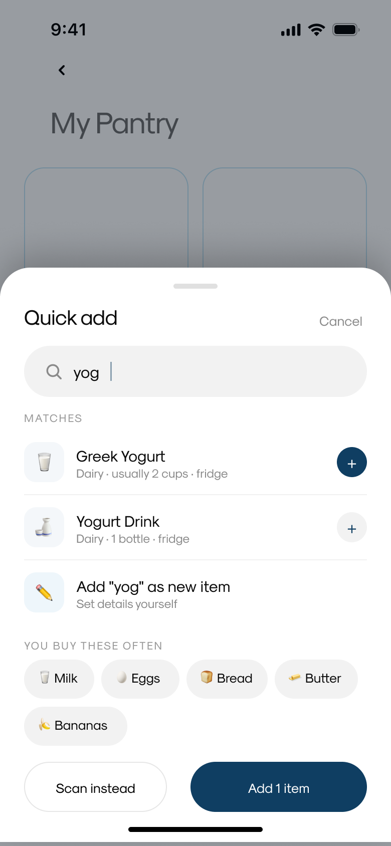
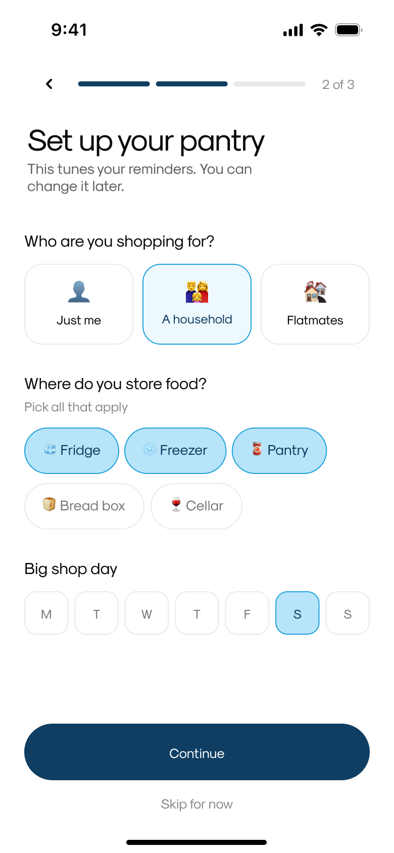
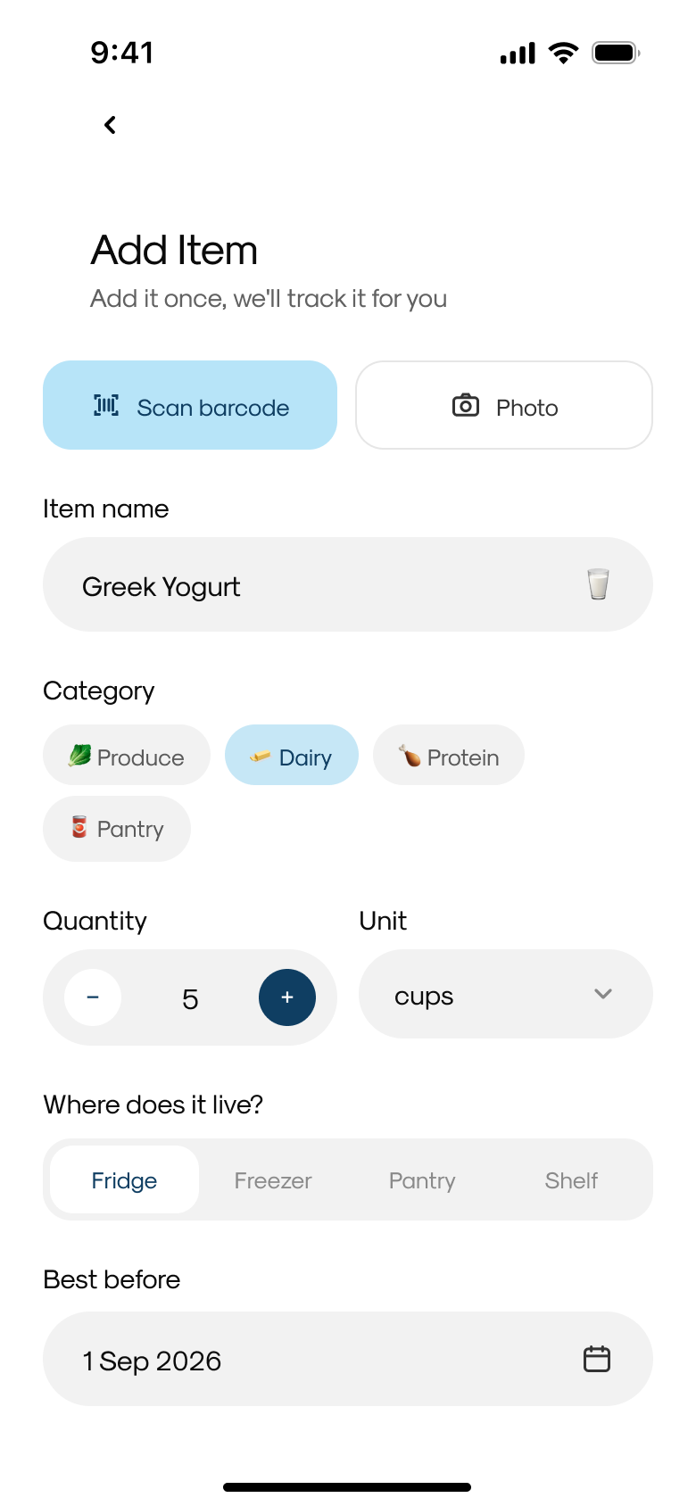
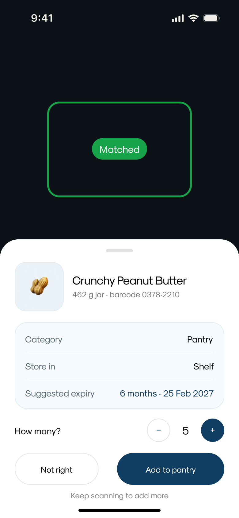
I designed two distinct entry flows instead of one compromise flow. Quick Add is a search-driven sheet with autocomplete, matched suggestions and one-tap shortcuts for frequently bought items, built for speed. The full form (barcode scan, photo, category, quantity, storage location, best-before date) is built for precision.
A single form that tried to do both would have been too slow for quick top-ups and too shallow for anyone who wanted to track quantity, storage location or exact expiry. Splitting them let each flow be genuinely good at its job instead of average at both.
Quick Add is the default path from Home and Pantry; the full form is reached when someone wants more control, barcode scanning, custom categories, or precise best-before dates.
Expiry as a timeline, not a countdown
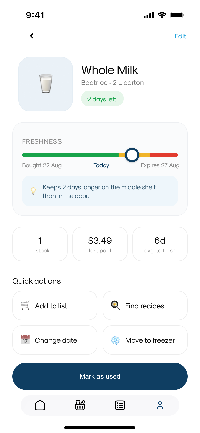
Most pantry apps reduce freshness to a number of days left. That tells you when something expires but nothing about why, or what to do about it.
I replaced the flat countdown with a freshness timeline: a visual bar from purchase date to expiry date with the current position marked, paired with a contextual storage tip and quick actions like add to list, change date, or move to freezer.
A countdown only tells someone there's a problem. A timeline with a tip and an action gives them a reason and a next step, which is what actually prevents waste, and that is the core promise of the product.
Item detail went from a passive status display to something that actively helps someone extend or use an item before it's wasted.
Meal planning framed around waste, not scheduling
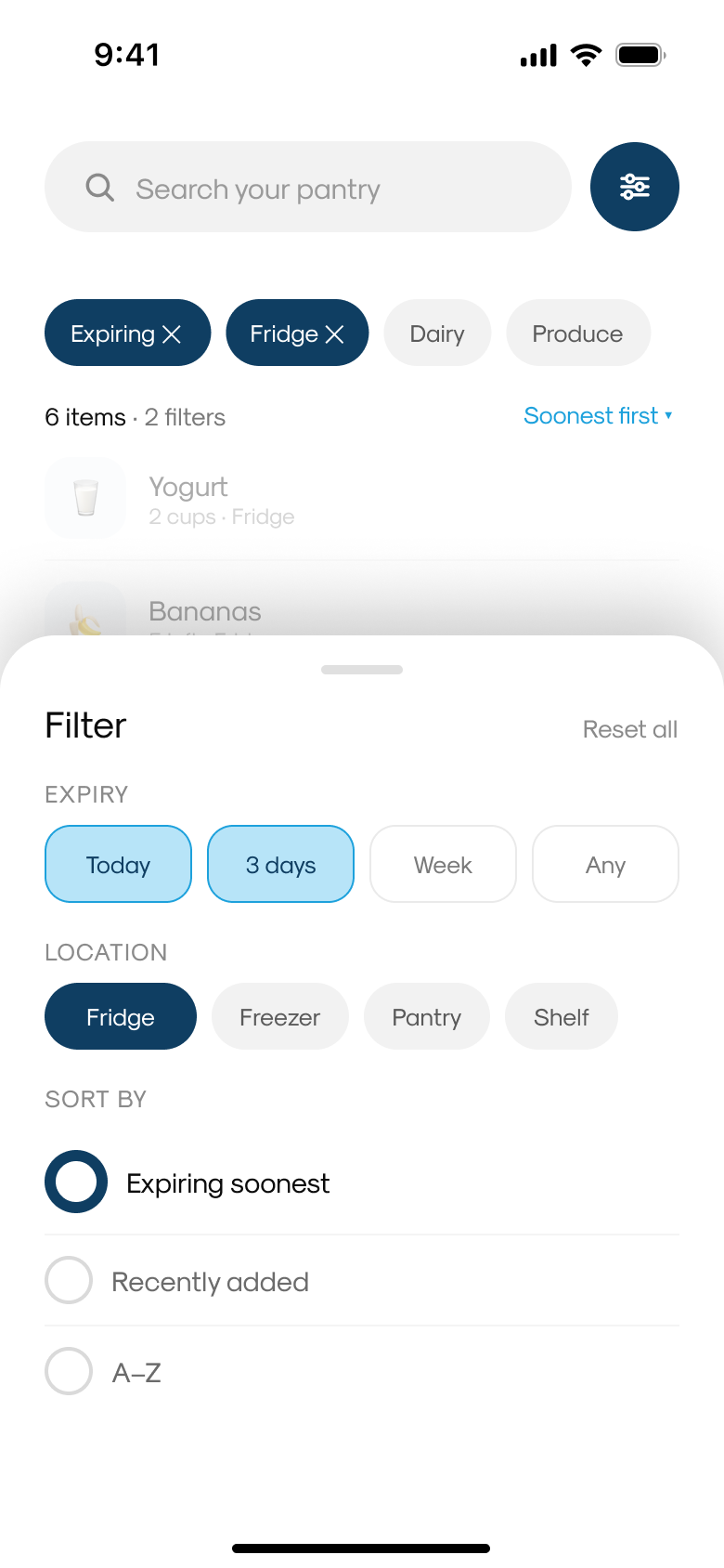
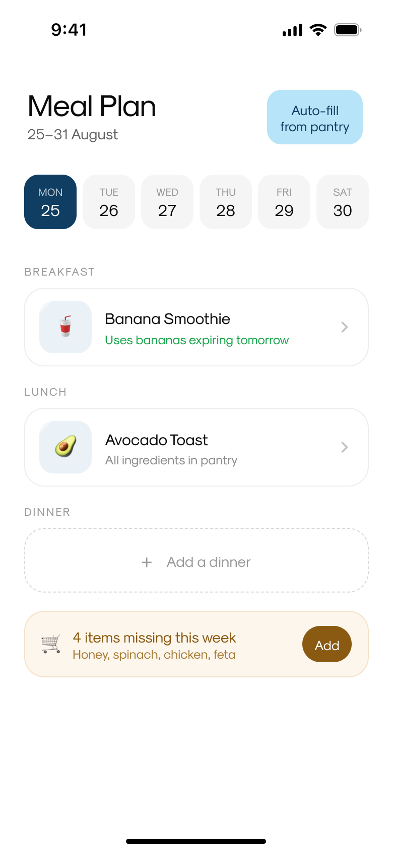
Meal planning wasn't part of the original scope, like household sharing, it was added later as the project grew. Once I decided to add it, I explored two structures: a traditional week grid with an auto-fill from pantry shortcut, and a waste-first agenda that leads with a Rescue Plan.
I kept the waste-first Rescue Plan framing as the primary meal planning experience, a set of meals chosen specifically to use up whatever's expiring soonest.
A generic week-grid meal planner is a commodity; most calendar and recipe apps already do it well. Leading with "these meals use up what's about to go bad" ties meal planning directly back to the core problem the app exists to solve.
Meal planning stopped being a separate scheduling tool and became another way the app answers what should I do about what's expiring.
Household sharing, with real permission boundaries
Household sharing wasn't in the original scope. The first version assumed a single person managing their own pantry, an assumption that started to feel incomplete, since groceries get bought and used by whoever's in the house.
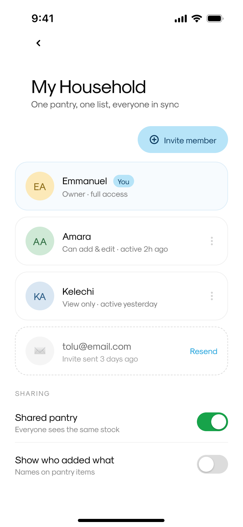
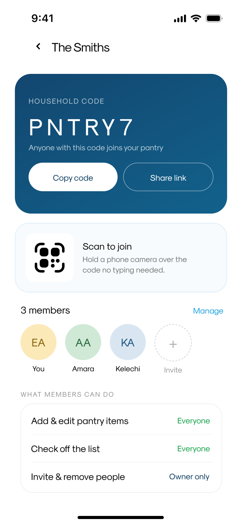
I designed household sharing around an invite code and QR join, with a clear breakdown of what each role can do: everyone can add items and check off the shopping list, but only the owner can invite or remove members.
A single-user pantry tracker doesn't hold up against how groceries actually work in most homes. But shared data without permission boundaries creates trust problems fast, anyone being able to remove another member, for example, so the feature only made sense with roles attached.
PantryPal moved from a single-user assumption to a genuinely shared tool partway through the project, without needing every member to have the same level of control.
What shipped, and what I cut
Everything shown here is a high-fidelity interactive prototype, not a shipped product, there's no live backend, no real users and no usage data yet. I'm stating that plainly rather than implying otherwise.
A few things were deliberately left out. Receipt scanning, photographing a grocery receipt to auto-populate the pantry, was explored early but cut: it would have added meaningful complexity around recognising products, quantities and expiry dates without being essential to proving the core loop.
I also caught a gap between Home and Profile during this process, they were nearly identical in an earlier pass, both showing pantry status. I redesigned Profile around account and household management instead, so the two screens now answer genuinely different questions.
Decisions as the evidence
PantryPal moved from a single-user pantry tracker concept to a connected, shareable system with a defensible reason for each major feature to exist, nothing here is included just because competitor apps have it.
Working solo across the full loop, from combining three habits into one data model to catching and fixing my own IA gap between Home and Profile, was a real test of scoping discipline without a team to catch blind spots.
There's no usage data or testing feedback yet, since this hasn't shipped. The evidence is in the decisions themselves: what was combined, what was split into two flows, what was left out, and why.
Prototype, ready for usability testing as a next step.
A discussion guide, not more screens
The honest next step is usability testing, so I put together a guide to run with 4–6 people, about 30 minutes each.
How do you keep track of what's in your fridge or pantry? When did you last throw something away because it expired unnoticed? Do you share shopping or cooking with anyone, and how does that coordination happen today?
Shown Home + Pantry: what do you think this app is for? What would you expect Add Item to do? Does Expiring Soon give you enough to act on?
Shown Quick Add vs. the full form: after a normal grocery trip, which would you reach for first? Is anything missing from the quick version that would make you switch?
Would you want to know if someone else added or removed pantry items? Does the permission split match how you'd want to share this with people you live with?
What would make you stop using this after a week? Was anything missing that you expected to see?
The lesson was scope discipline
The most useful lesson from this project wasn't about any single screen; it was about scope. Receipt scanning, more complex recipe recommendation logic and a fuller notification system were all things I could have added. Cutting them kept the project focused on proving one thing well: that pantry, shopping and meal planning genuinely work better as one connected system than as three separate habits.
If I were to take this further, the next step is usability testing with a real household, not more screens. The riskiest untested assumption is whether people will keep pantry data current enough for the rest of the app to be useful, and that's something no amount of additional design can answer on its own.