Designing for "am I actually ready?" instead of just "what's the plan?"
As product designer on a three-person team I lead the UX and key design decisions for TripWise, a travel app built around trip readiness rather than itineraries, working directly with a full-stack developer through the build.
Trip prep is spread across five tools
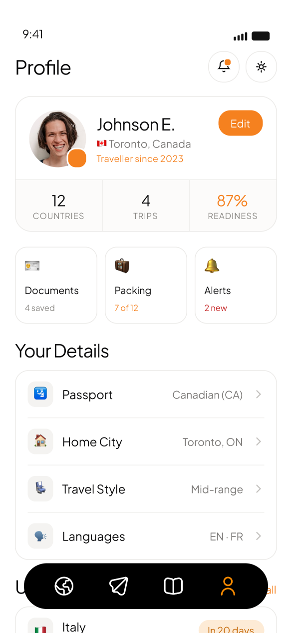
Preparing for international travel means juggling several disconnected concerns at once: visa requirements, vaccinations, packing for the destination's weather, insurance that has to still be valid on the return date, currency, local plug types. Most travel apps handle exactly one of these well and leave the rest for the traveler to track in their head, a notes app, or several different tools.
Picture someone with a trip three weeks out. They have booked flights and a hotel, but haven't checked whether their visa situation is sorted, whether their travel insurance actually covers the full trip, or what they still need to pack for the weather at their destination. Nothing is technically wrong yet, but nothing confirms they are actually ready either.
One answer, not five open tabs
The trigger for this project was a mix of things: personal frustration with how fragmented travel prep is across different apps, and noticing that existing travel tools each solve one narrow piece, planning or packing or documents, rather than the whole picture of being ready.
Designing alongside the build, not ahead of it
I own the UX and overall design structure for TripWise, making the key design decisions across the app. The copywriter owns content and microcopy.
I also work directly with the full-stack developer through implementation rather than handing off static designs and stepping away, which matters for a project still actively being built and adjusted. This is personal-experience-driven work rather than formally researched; there is no user testing yet, since the app hasn't reached that stage.
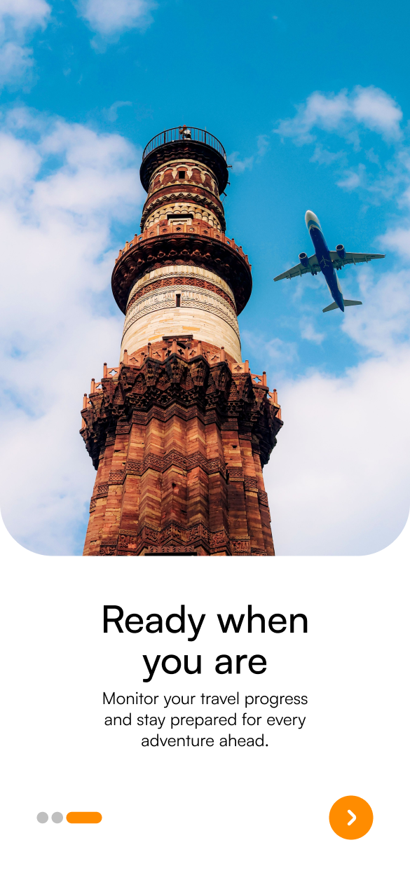
Readiness as the organizing idea
Hypothesis: if a traveler had one score and one place that pulled together documents, packing and destination requirements instead of five disconnected tools, they would actually know whether they were ready to go, not just what was on their itinerary.
The guiding principle was to make readiness the organizing idea for the entire app, not a feature within it. Every screen either contributes to that readiness picture or acts on something it surfaced.
Trip readiness as a single, ongoing score
Most travel apps show a flat checklist or itinerary with no sense of overall status. Everything looks equally urgent, or equally ignorable.
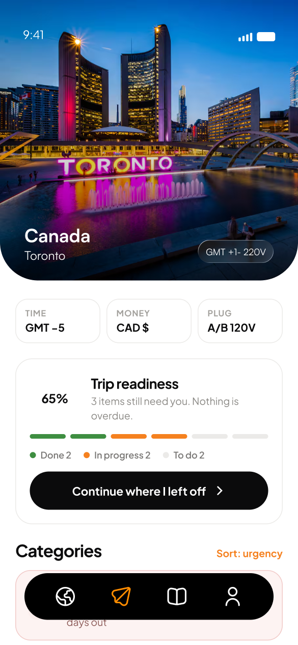
I designed a trip readiness score, a percentage paired with a done / in progress / to do breakdown, as the central metric on both the home and trip screens, with a "Continue where I left off" action tied directly to it.
A single, ongoing score gives a traveler an immediate, honest answer to the question they actually have, instead of asking them to mentally tally a checklist themselves. It also gives the app a natural, non-alarming way to signal progress without treating every unfinished item as equally urgent.
The app's central metric became a status, not a list: something a user could check in on rather than something they had to fully parse each time.
Destination requirements surfaced, not researched
Visa rules, required vaccinations and safety advisories are normally scattered across government sites, forums and other apps. The traveler has to know to go look for them.
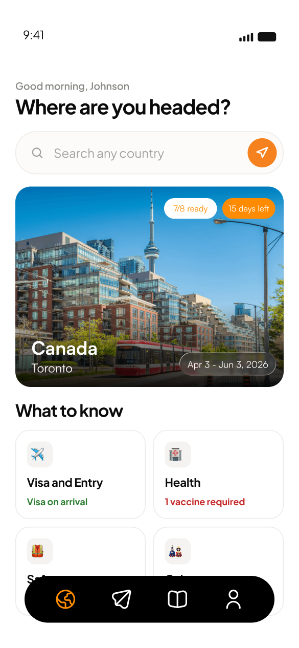
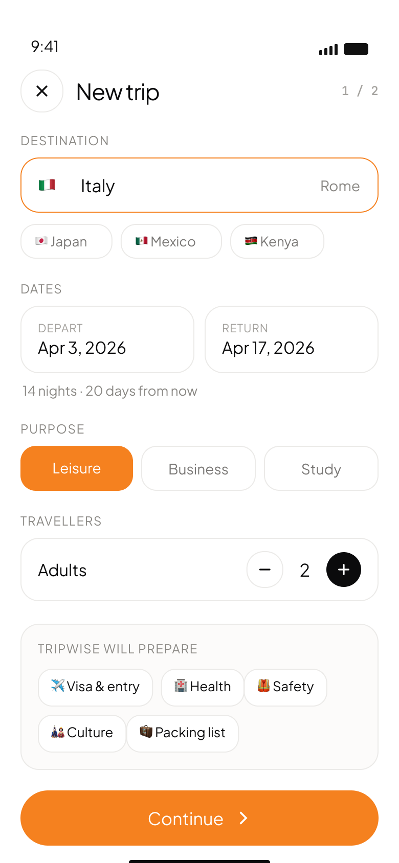
I designed a "What to know" section on the destination screen, visa and entry, health, safety, culture, each summarized with a clear status such as "Visa on arrival" or "1 vaccine required," right where the traveler is already looking at their trip.
A traveler shouldn't need to know what questions to ask before they can find the answers. Surfacing these categories automatically, with a status at a glance, turns research the traveler wouldn't necessarily think to do into information they encounter passively just by opening the app.
Destination requirements moved from something to research elsewhere to something surfaced directly, closing one of the most likely gaps in the fragmented-tools problem this app exists to solve.
A packing list that reacts to conditions
Generic packing list templates don't account for what is actually happening at the destination, weather or local norms, leaving the traveler to adjust the list manually.
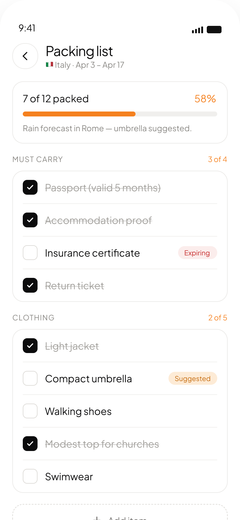
I designed the packing list to flag context-aware suggestions directly in the list: a compact umbrella marked "Suggested" with a note that rain is forecast in Rome, and an "Expiring" flag on a document tied to the packing context.
A packing list that just sits there as a static checklist misses the chance to actually help. Flagging suggestions based on real conditions turns the list from a memory aid into something that proactively catches things a traveler might not think of themselves.
The packing list became a living, responsive part of the readiness picture, not a one-time checklist filled in and forgotten.
One expiry-aware home for every document
Passports, visas, vaccination certificates and insurance policies are normally scattered across physical copies, emails and other apps, with no single view of what is valid, expiring or missing.
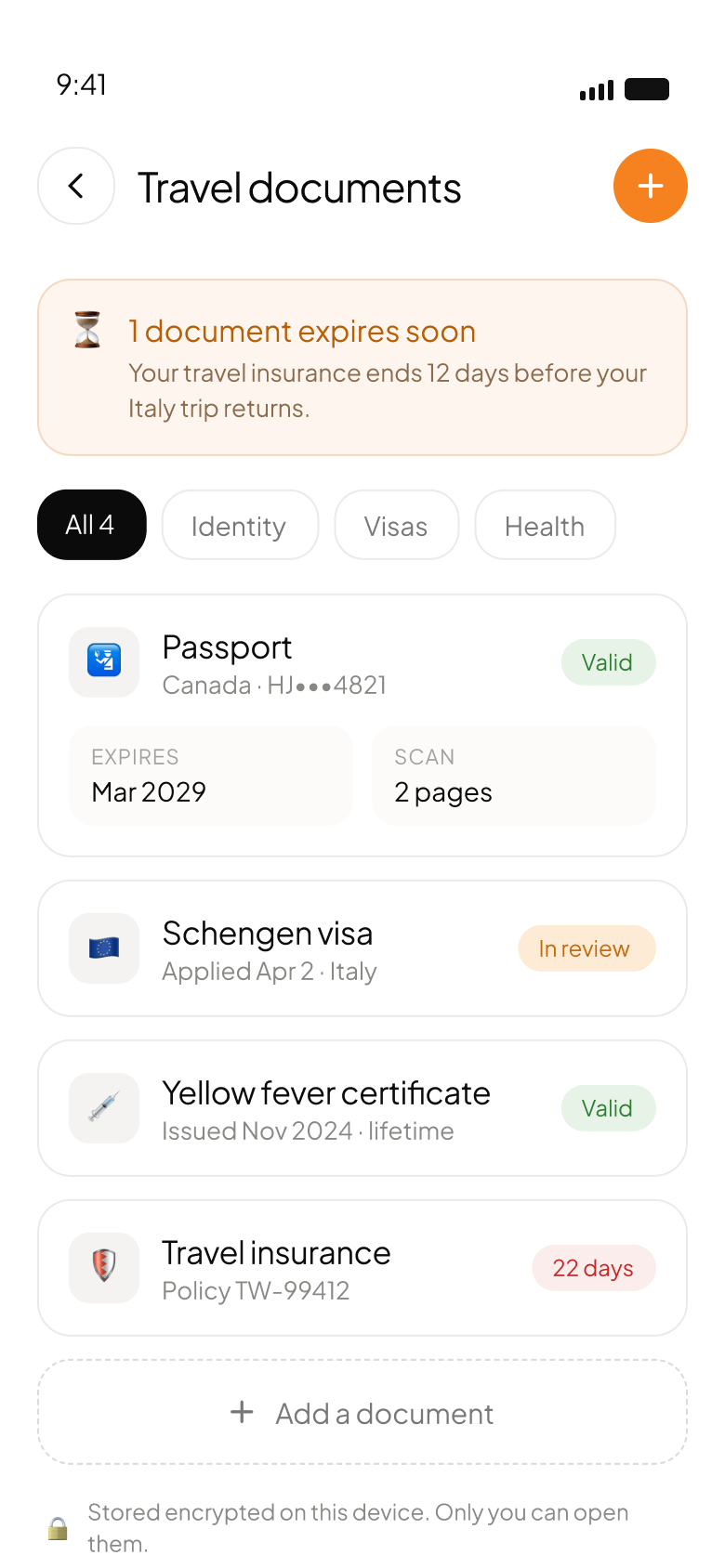
I designed a travel documents screen consolidating all of them, passport, visa, health certificate, insurance, each with a clear status (valid, in review, or a countdown like 22 days) plus a proactive banner surfacing the single most urgent expiry issue.
The riskiest travel document problems are the ones a traveler doesn't notice until it is too late, insurance that lapses days before a trip ends being the clearest example. Centralizing every document with expiry awareness turns a passive folder into something that actively catches these problems ahead of time.
Document management moved from static storage to an active part of the readiness system, surfacing the specific risk rather than just storing a file.
A proactive alerts feed
Even with readiness, documents and packing all tracked, a traveler shouldn't have to open each section individually just to see if anything changed.
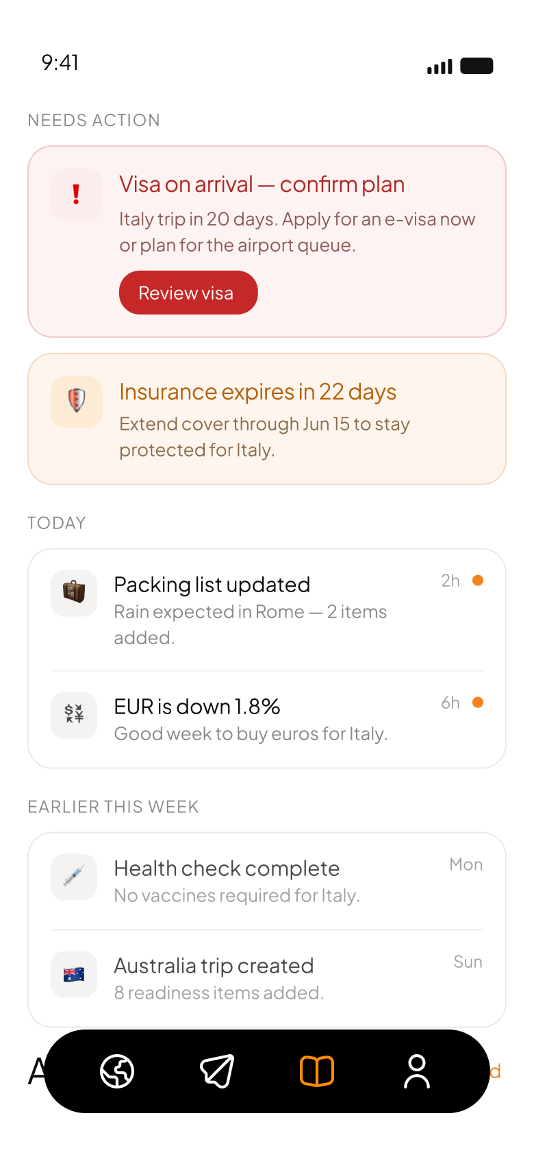
I designed an alerts feed surfacing time-sensitive items directly: a visa needing confirmation, an insurance expiry, a packing list update triggered by a weather change, even a favorable currency movement, organized by urgency and recency.
Readiness isn't a one-time check. Conditions change between when a trip is booked and when it departs, so a proactive feed means the app tells the traveler what changed rather than relying on them to remember to check.
The app shifted from something a traveler has to actively interrogate to something that surfaces what needs attention on its own.
Built with the developer, not handed over
Because this project is still in development, implementation isn't a separate later phase. I work directly with the full-stack developer as features get built, adjusting design decisions against real technical constraints as they come up. The copywriter owns the app's content and microcopy throughout.
This is a small, three-person team, which means less handoff and more continuous, direct collaboration than the agency-team projects elsewhere in this portfolio.
Honest about what exists
TripWise is still under active development. There is no public release, no shipped version, and no user testing has happened yet.
I have no outcome data to report, because there isn't a finished, tested product yet. I am stating that plainly rather than describing a result that doesn't exist.
This project differs from the shipped work in this portfolio in an important way: I am not just designing screens, I am working through implementation decisions with the developer in real time, so design decisions are tested against technical feasibility continuously rather than validated after the fact.
Readiness beats itinerary
The clearest idea shaping this project so far is that readiness is a stronger organizing principle than itinerary for this kind of app. It gives every feature, from packing to documents to alerts, a shared reason to exist rather than being separate tools bolted together under one app icon.
Since this hasn't been tested with real users yet, the honest next step is exactly that: usability testing to see whether the readiness score, the destination requirement cards and the proactive alerts actually reduce the anxiety and fragmentation they are designed to address, rather than just looking like they should.