Rebuilding a storefront around what it's actually selling.
As Product Designer at The CEO Creative, I led the homepage redesign that turned a cluttered, hard-to-navigate storefront into a business organized around clear service categories and its core NET30 financing offer.
View website ↗
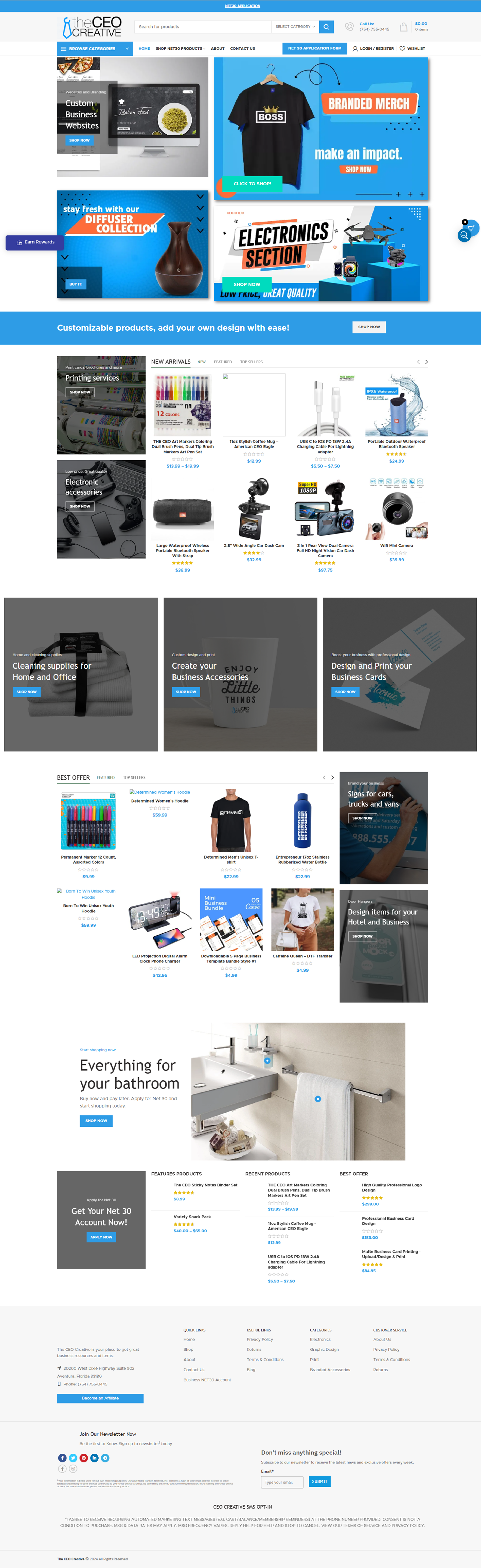
A wide catalog, all shouting at once
The CEO Creative isn't a single-category store. It spans apparel, drinkware, office supplies, printing, tech accessories and customizable branded merch, plus web design services and a NET30 buy-now-pay-later program for businesses. That range is a strength, but it turns into visual noise the moment the homepage stops organizing it.
Picture a small business owner landing on the site looking for branded T-shirts for her team, or trying to work out whether she qualifies for NET30. If the homepage greets her with a dozen competing promotional banners of similar size and weight, she has to work out what this business actually does and whether it's for her, and she may leave before finding out.
A business problem, not a visual refresh
Sales were low, and the team was hearing directly that people found the old site hard to navigate. That gave the project a clear bar: this wasn't a restyle, it was a fix for a business problem.
Design lead in a cross-functional team
I was the Product Designer on this project, working with Marketing, a copywriter, a PM, the CEO and a developer. I owned the UX and UI of the homepage redesign: restructuring the information architecture, deciding what got visual priority, and designing the new layout.
Marketing and the copywriter shaped messaging, the PM managed scope, the CEO weighed in directly given how central NET30 is to the business, and the developer implemented the build.
Lead with the offer, group the rest
Hypothesis: if the homepage organized the catalog around clear categories and led with NET30 instead of burying it, more visitors would find what they came for and more businesses would apply for financing, directly addressing the low sales and navigation complaints driving the project.
The guiding principle was to design around what the business actually needed visitors to understand first, the range of what's sold and the NET30 offer that sets it apart, rather than treating every promotion as equally important.
Navigation reorganized around named categories
The old homepage presented products through a grid of similarly weighted promotional banners, diffusers, electronics, branded merch, printing, with no clear hierarchy or entry point for someone who knew roughly what they wanted.
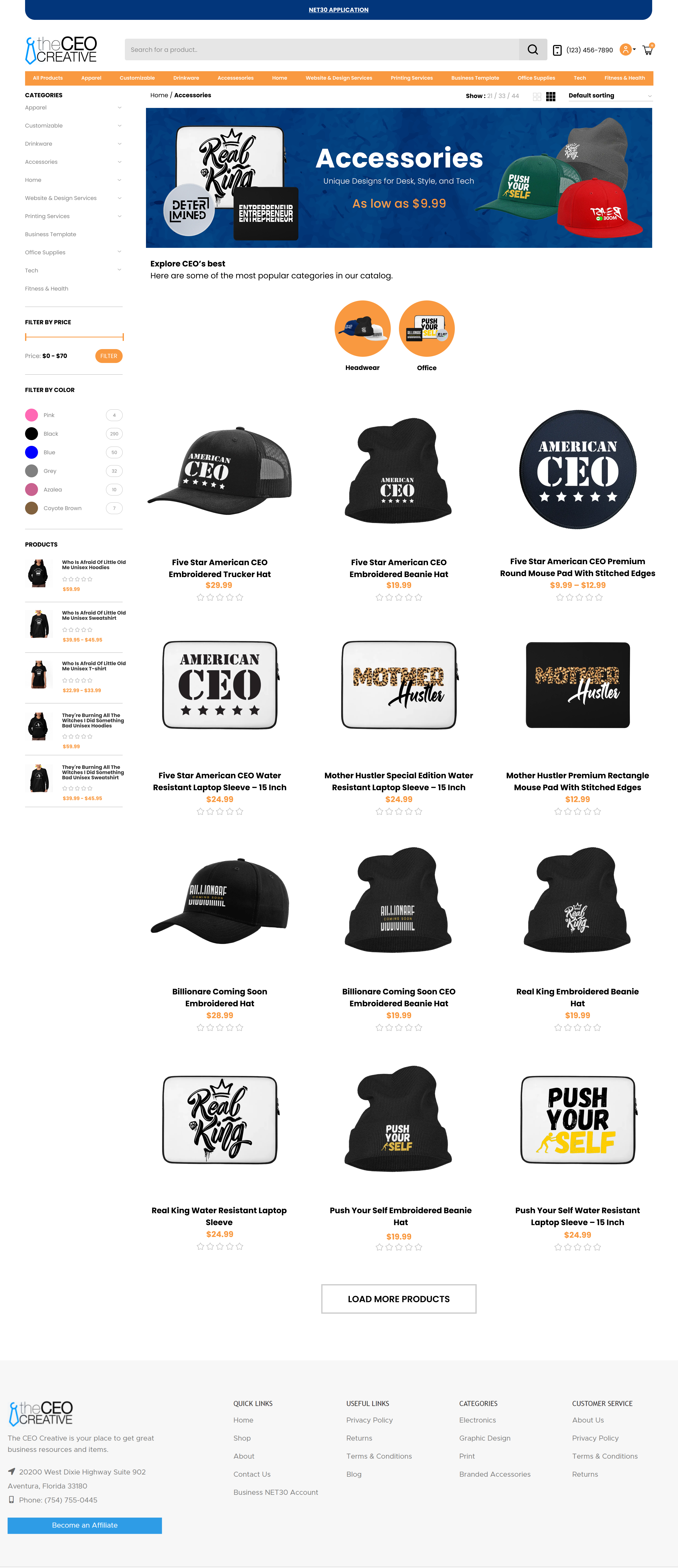
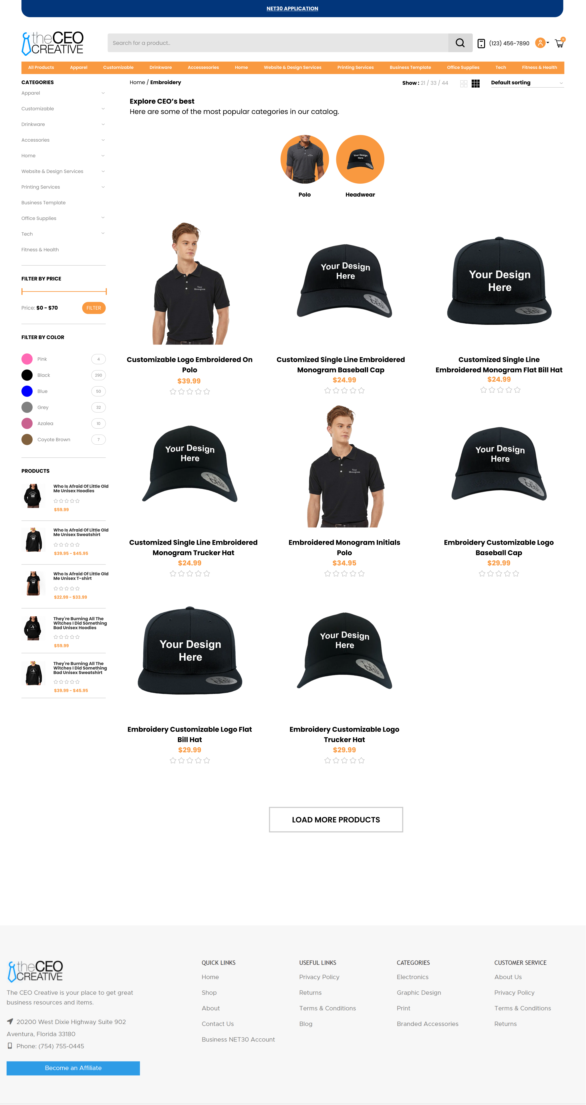
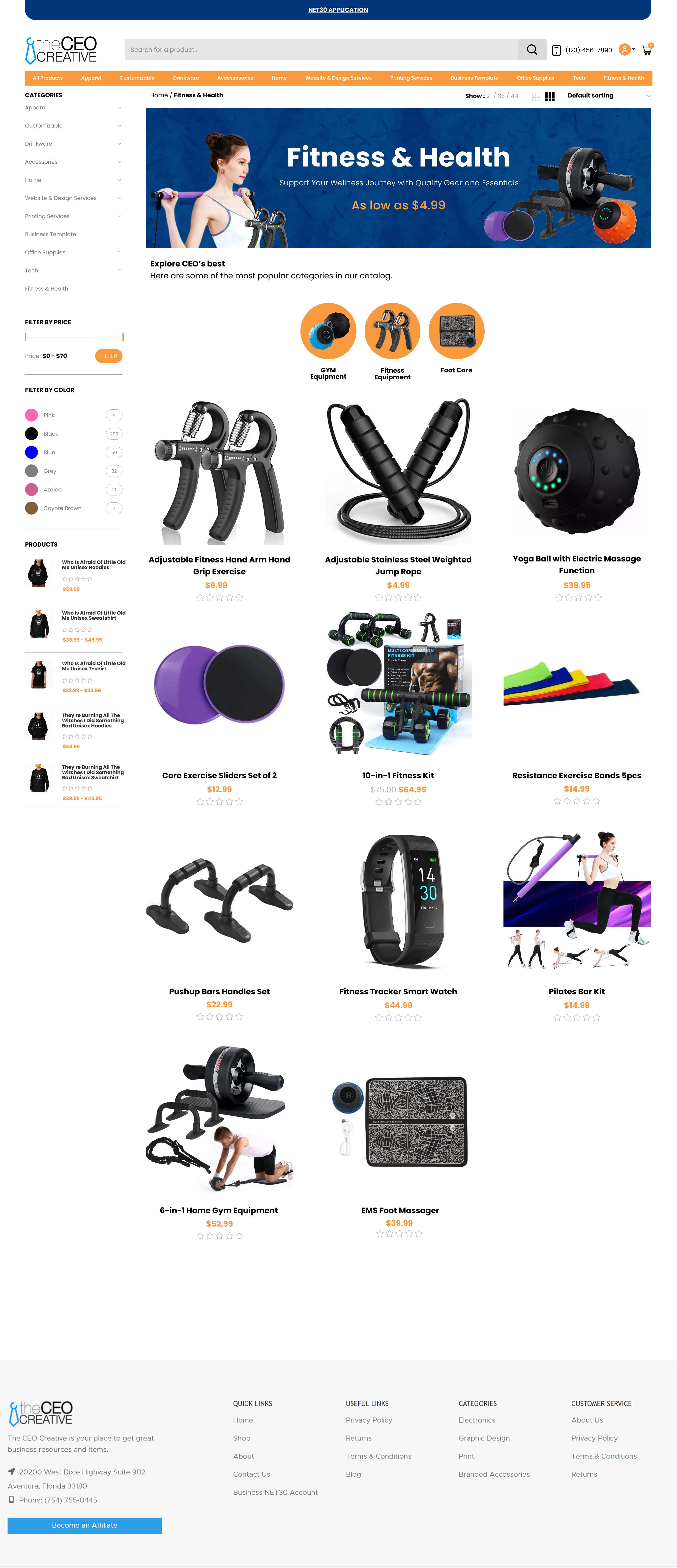
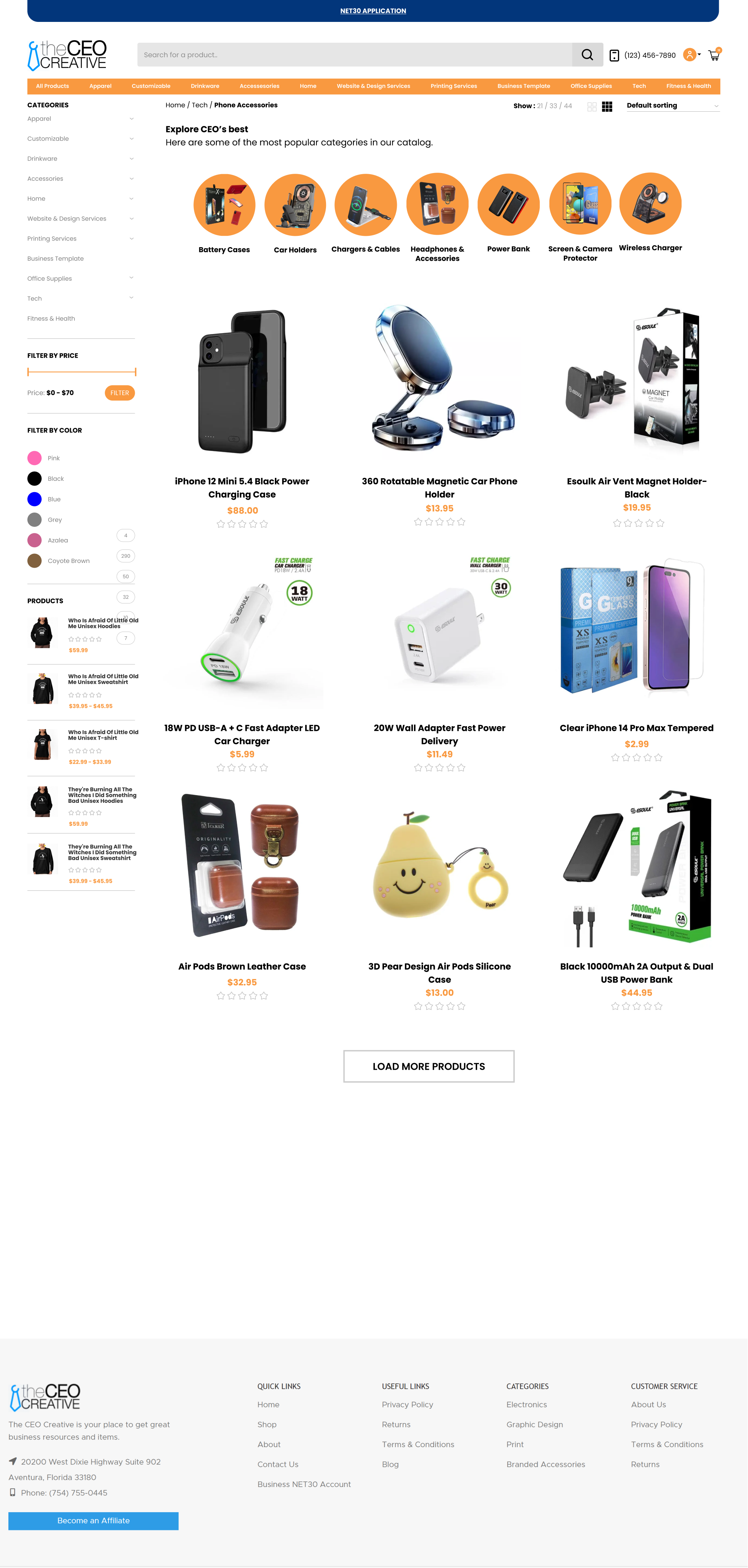
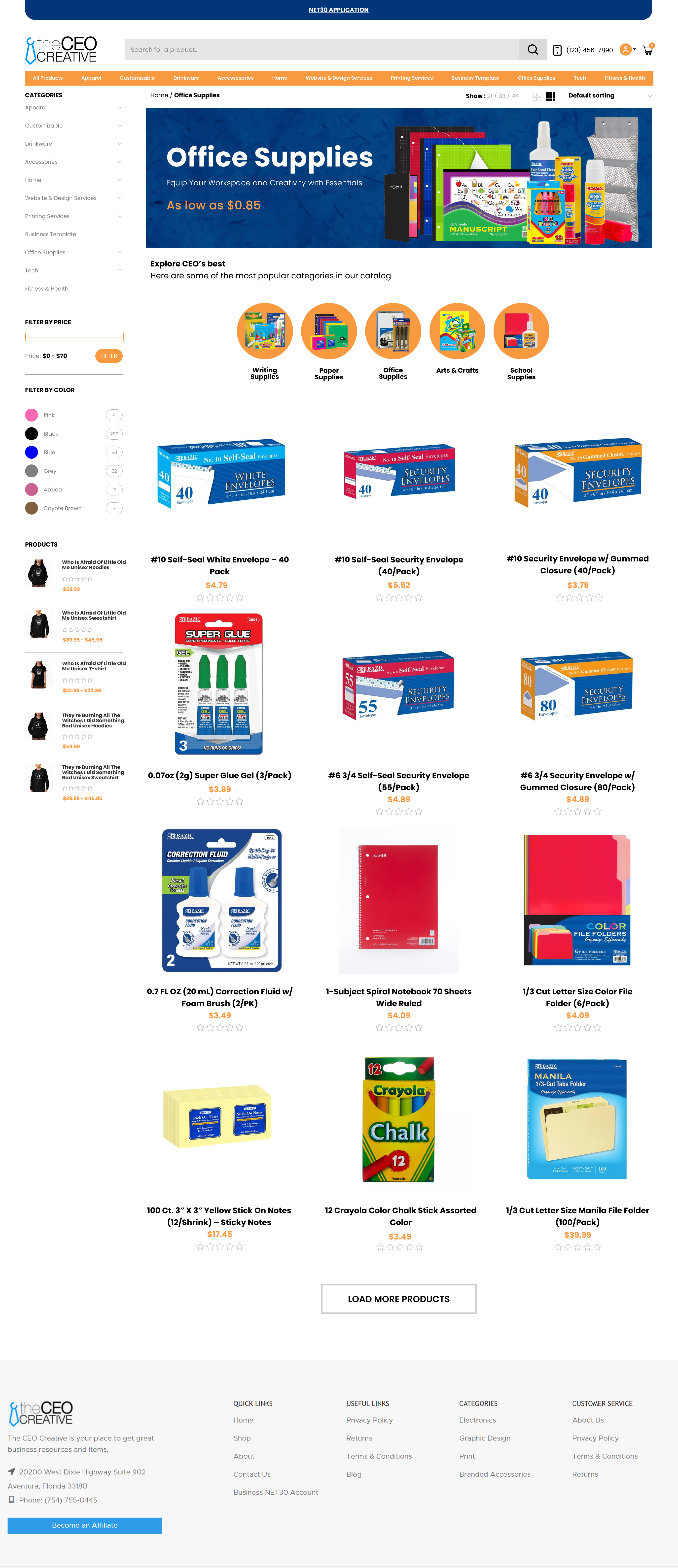
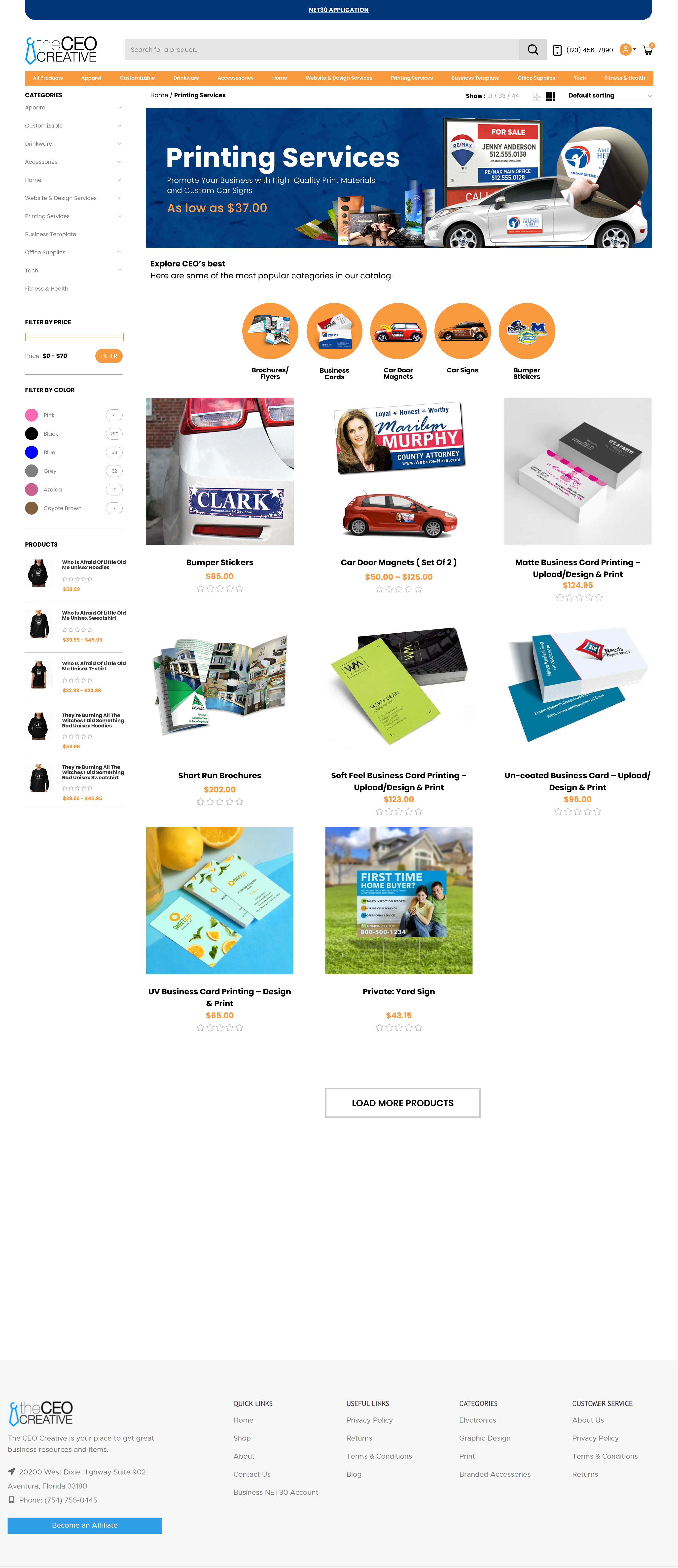
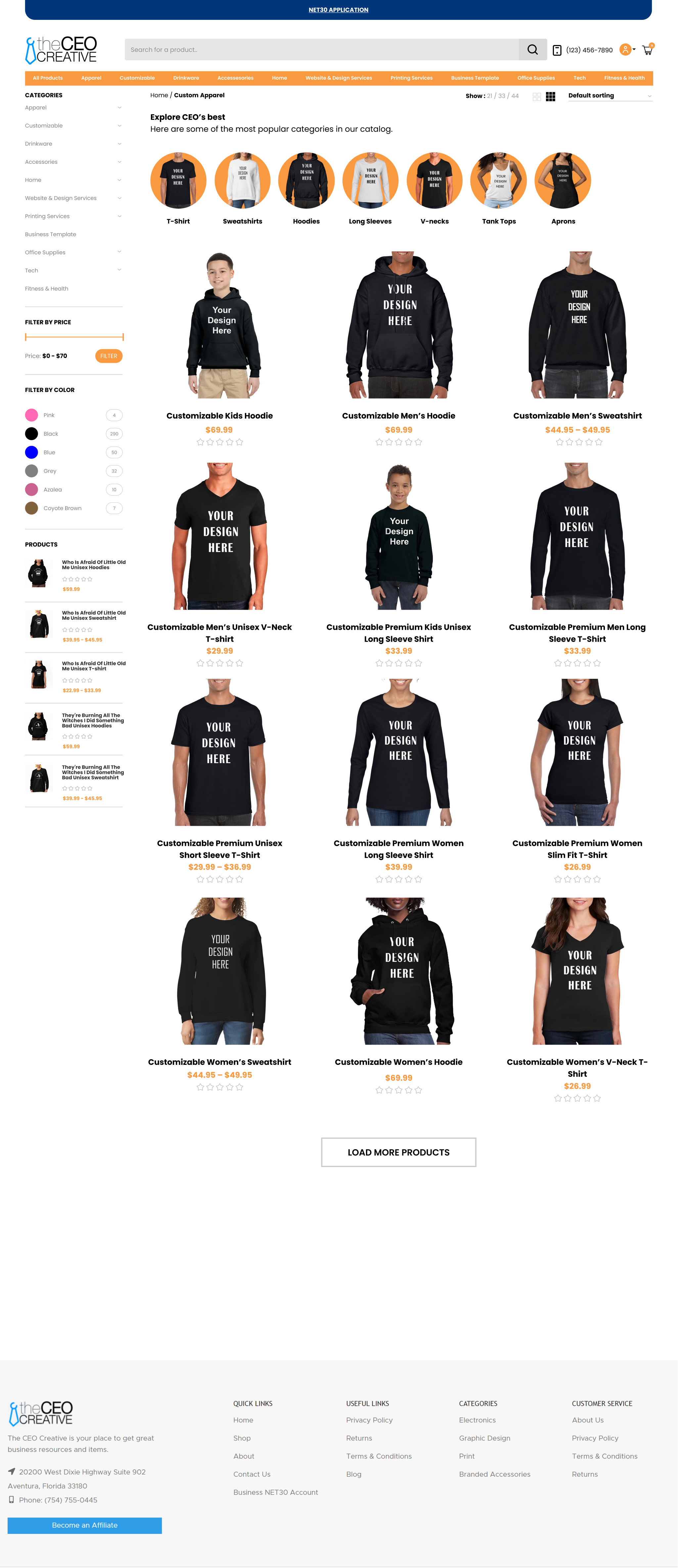
I restructured the homepage around named, icon-led categories: Apparel, Drinkware, Office Essentials, Printing Services, Phone Accessories and Customizable Products, each with its own section and clear sub-links.
A visitor who knows they need branded apparel shouldn't have to scan a dozen unrelated banners to find it. Naming and grouping categories explicitly turns browsing from a search into a direct path.
The homepage went from a flat grid of promotions to a structured catalog a visitor can scan and navigate by their actual need.
NET30 moved from a small banner to the hero
In the old design NET30, the business's core financing offer, appeared as one small banner among many, no more prominent than a diffuser collection or an electronics sale.
I redesigned the hero to lead with NET30 directly: "We Make Shopping Easy For You", paired with a clear apply-for-NET30 call to action, positioned as the first thing any visitor sees.
NET30 isn't just another promotion, it's a differentiator that changes how a business customer can buy. Burying it at the same visual weight as a product sale undersold the thing most likely to convert a hesitant B2B buyer.
NET30 became the first message on the page instead of one of many, giving it visual priority that matched its actual importance to the business.
Trust signals that didn't exist before
The old homepage had no testimonials, no social proof and nothing that reassured a new visitor this was a business other people trusted.
I added a client testimonials section with named clients and photos, plus a video section showcasing the company's service and printing work.
For a B2B buyer considering NET30 financing or a first bulk order, trust matters more than product photography. Real client names and a video of the actual service close a gap that product grids alone can't.
The homepage went from a pure product catalog to one that also makes the case that this is a business worth trusting.
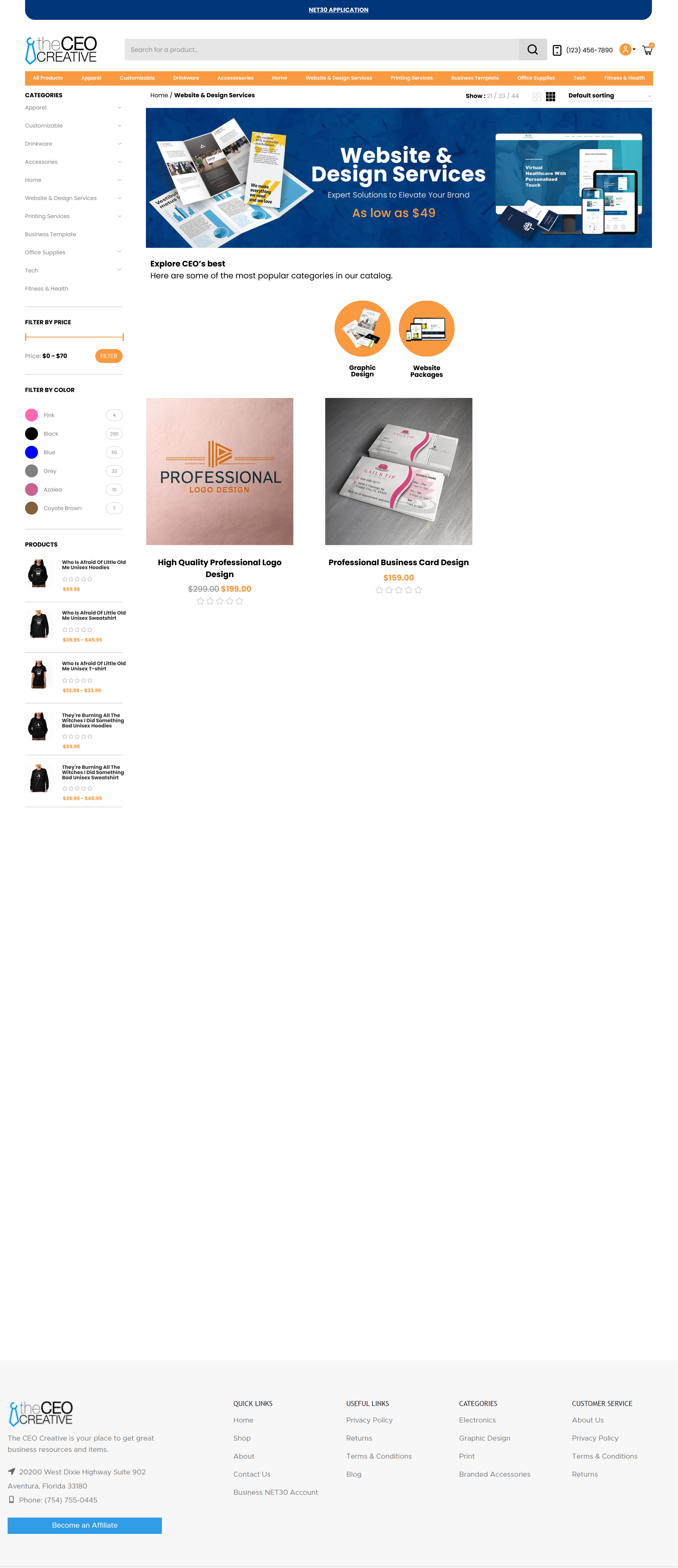
Fewer, clearer sections
The old homepage stacked many small promotional sections in a row, cleaning supplies, business cards, bathroom essentials, best offers, each fighting for attention with no clear reading order.
I consolidated the page into fewer, more clearly separated sections: hero, NET30 custom products by category, a benefits explainer for NET30, testimonials and a blog preview, each with visual breathing room and a clear purpose.
A homepage that presents everything at once, with equal weight, effectively presents nothing. Reducing the number of competing sections gave each one enough space to communicate before the next started.
The page went from a dense layout that only rewarded effort to one with a clear reading order, from what is this business, to why you should trust it, to how to get started.
Shipped with the whole team
The developer implemented the new structure, Marketing and the copywriter reworked messaging to match the new hierarchy, the PM managed scope and timeline, and the CEO was directly involved given how central NET30 is to the business model.
This was a cross-functional effort grounded in a stated business problem, low sales and poor navigation, not a redesign for its own sake. The same reorganization carried through to mobile, where navigation problems are usually worse.
Higher conversion, more NET30 signups
The redesign led to higher conversion and more businesses registering for NET30, the two outcomes the project was meant to move.
The team reported that customers could now shop without the friction and confusion the old site caused.
I don't have access to the specific conversion or registration figures, that data sits with the business, so I'm stating the outcome directionally rather than with numbers I can't verify.
Live in production at theceocreative.com.
Start with the problem, not the style
The clearest lesson was that a homepage redesign for a business problem needs to start with the problem, not the visual style. Low sales and navigation complaints pointed directly at information architecture and hierarchy, so the highest-leverage decisions here were structural, what gets grouped and what gets top billing, rather than decorative.
If I were to take this further, I'd want conversion and NET30 registration data broken down by section, to know which of the four decisions moved the needle most rather than crediting the redesign as a whole.