Designing both sides of a booking relationship.
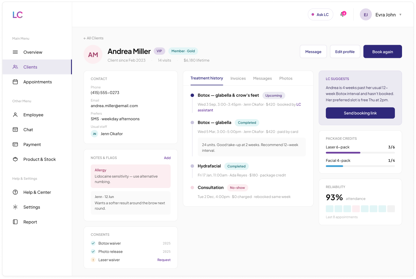
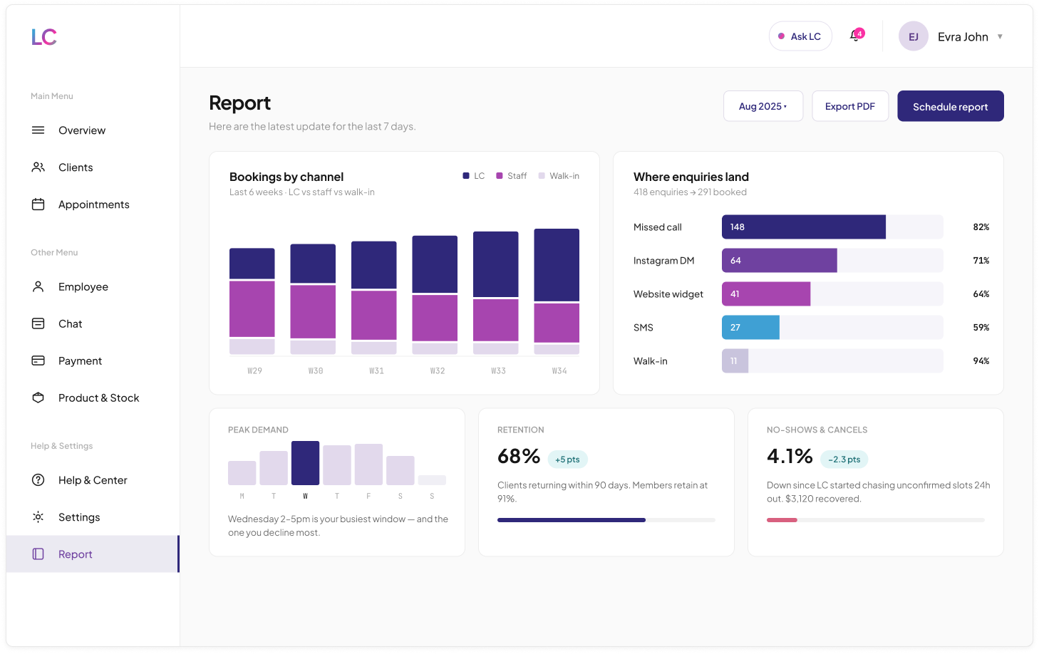
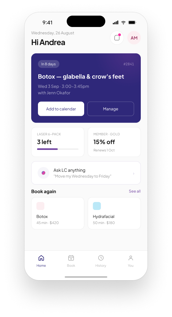
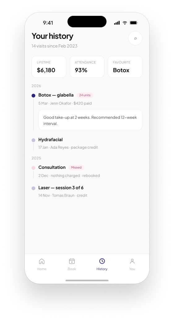
I designed Lumina Clinic solo: a two-sided booking platform for aesthetics and wellness clinics, built to fix a real gap I saw in Toronto's clinic booking systems. It covers the client-facing app and the business-side dashboard with an AI scheduling assistant.
Booking tools that only solve half the problem
Toronto has plenty of aesthetics and wellness clinics, but the booking systems behind them tend to be split in an unhelpful way. Either a convenient client-facing app that gives clinic staff little real control, or practice-management software built for staff that treats the client experience as an afterthought. Neither side gets designed with the other genuinely in mind.
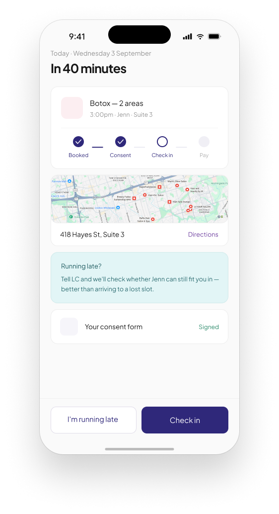
Picture a clinic that loses a Friday afternoon slot to a late cancellation while eleven people sit on a waitlist for that exact treatment, and nobody closes the gap in time. Or a client who is unsure whether their $50 deposit is refundable, discovers a package of prepaid sessions is about to expire, or simply forgets to rebook the appointment their practitioner actually recommended. These are the same underlying problem, a gap between what a clinic could offer and what a client is actually shown, seen from two different sides.
A gap in the market, not a client brief
This was a new, solo build aimed directly at a gap I saw in how Toronto clinics handle booking. Not a rebrand, and not a client brief, but building the product I thought this market was missing.
Solo across both products, and honest about the research
I designed Lumina Clinic solo, end to end: every screen on both the client app and the business dashboard, including the AI assistant's permission model.
Because this is a personal project built to address a gap I identified directly in the Toronto market, the direction came from that observation rather than a formal brief or user research. There is no user testing yet, since the product is still in development, and I am stating that plainly rather than implying otherwise.
Two views of one relationship
Hypothesis: if the client app and the business dashboard were designed as two views of the same underlying relationship, bookings, payments, waitlists and packages, rather than as separate products, both a clinic and its clients would get fewer missed opportunities. Fewer empty slots, fewer expiring credits, fewer forgotten rebookings.
The guiding principle was continuity across both sides. Anything that mattered to a client, a waitlist spot or a package expiring, needed a clear counterpart on the business side: who to offer that slot to, when a package needs a nudge. And anything the business automated, such as an assistant chasing a confirmation, needed to be visible and explicable to the client receiving it.
One alerts feed instead of scattered notifications
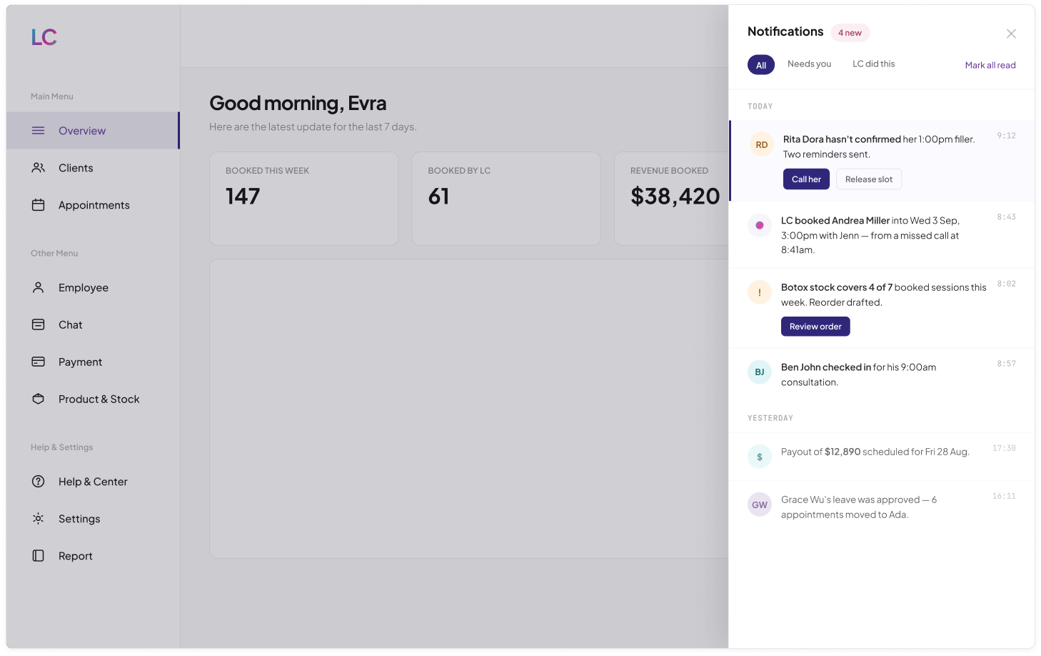
A client's relationship with a clinic involves several kinds of time-sensitive information: appointment confirmations, waitlist openings, expiring package credits, payment receipts. Most apps split these across separate screens or notification types.
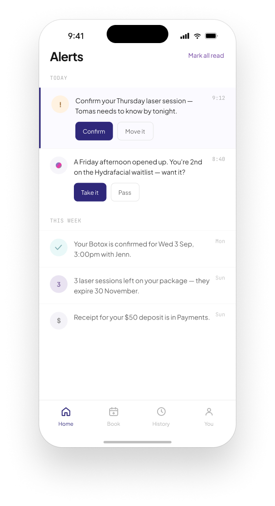
I designed a single, prioritised Alerts feed as the client app's home screen, combining confirmation requests, waitlist offers, package status and payment receipts into one chronological stream, each with its own direct action: Confirm, Take it, Pass.
A client should not have to check four different places to know what needs their attention. A unified feed, ordered by urgency and recency, means the most time-sensitive item, a same-day confirmation or a waitlist spot about to close, is never buried behind less urgent information.
The client's home screen became a single source of what needs my attention, rather than a menu of separate features to check individually.
Cancellation flows that default to rescheduling
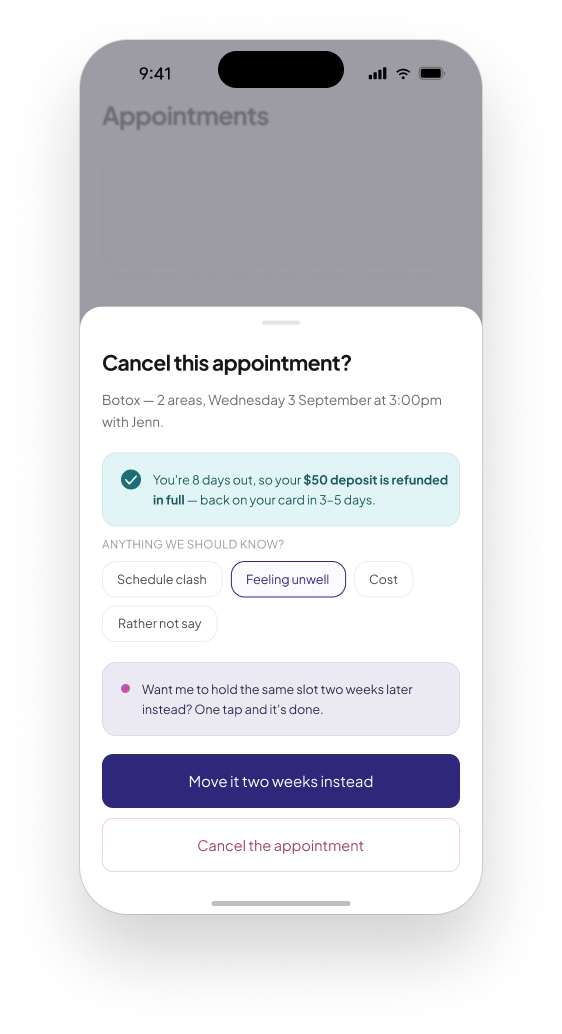
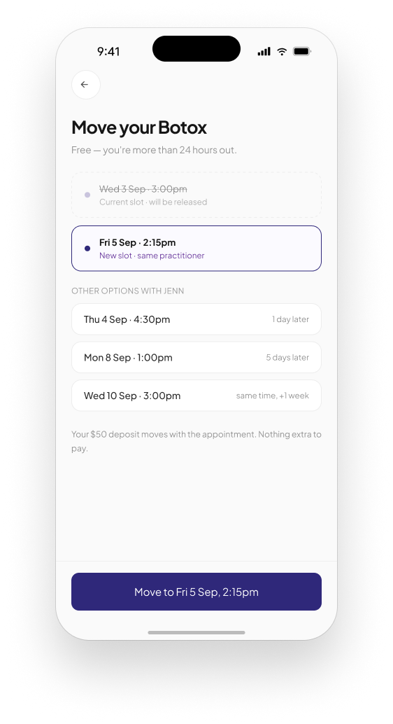
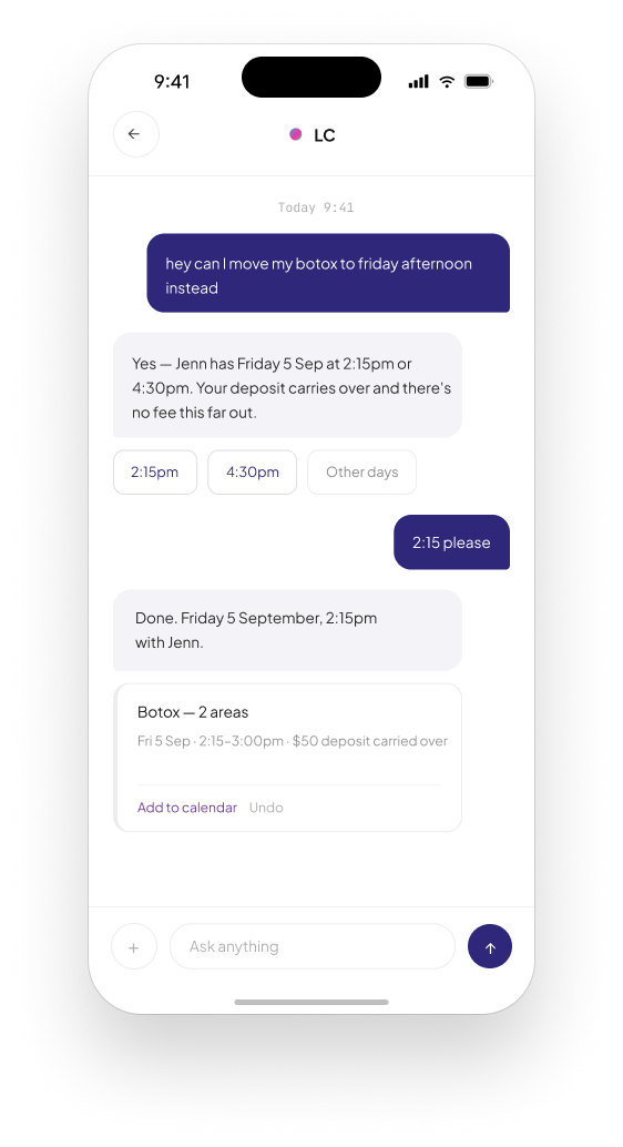
A cancellation is a lost booking for the clinic and often an awkward deposit conversation for the client. Most apps treat it as a single, final action.
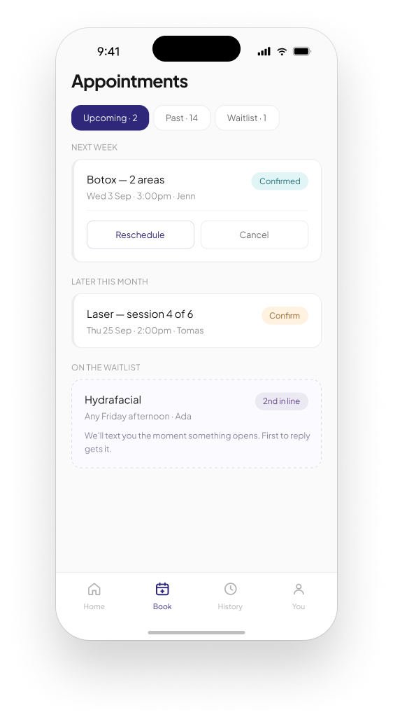
I designed the cancellation flow to lead with a reschedule offer, Move it two weeks instead, generated automatically, with outright cancellation available but visually secondary, alongside an upfront statement of the deposit refund policy based on how much notice was given.
Most cancellations are not really I never want this appointment. They are not this exact time. Leading with a concrete, one-tap reschedule addresses the client's actual need in most cases, and the transparent refund policy removes the uncertainty that might otherwise make someone hesitate to cancel honestly in the first place.
A cancellation stopped being purely a lost booking and became, more often, a rescheduled one, with the deposit policy handled honestly either way.
Feedback, rebooking and payment on one screen
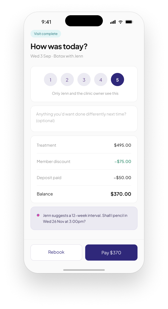
After an appointment a client typically has to handle feedback, paying any remaining balance, and rebooking as three separate interactions. Three separate reasons to open the app, or three separate reasons not to.
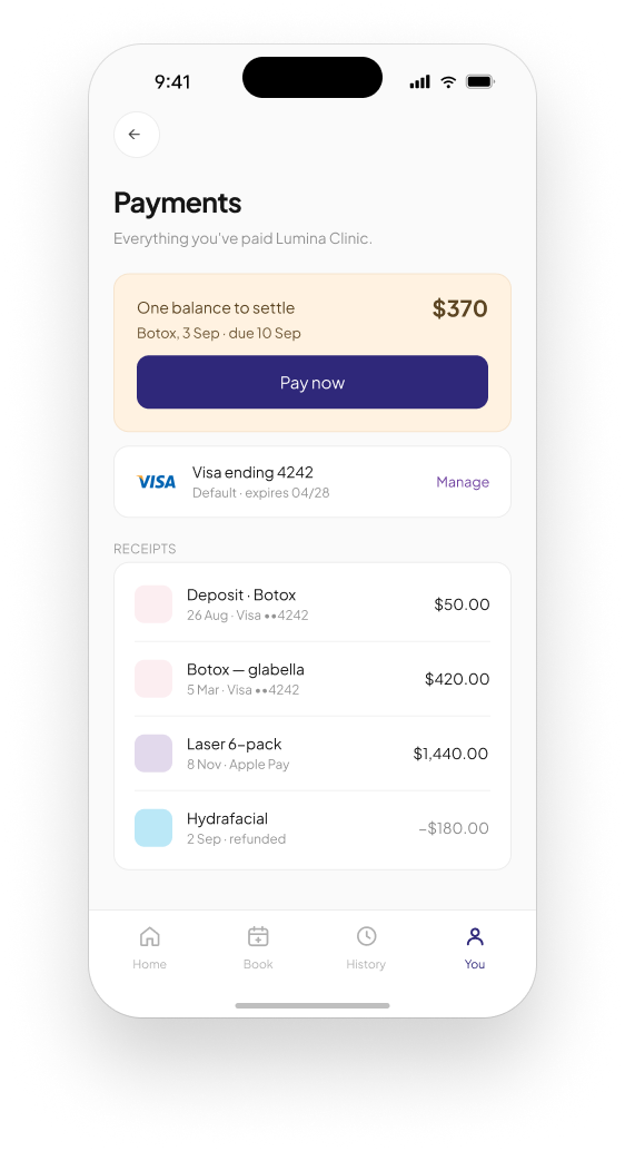
I designed a single post-visit screen combining a private satisfaction rating, an optional note, a clear balance breakdown of treatment cost, member discount and deposit already paid, a practitioner-suggested rebooking interval, and the payment action.
Bundling these means the client resolves the entire post-appointment relationship in one sitting, right when the visit is freshest in their mind, instead of leaving balance payment or rebooking as a task to remember later and possibly forget.
Post-visit follow-through became a single completed action instead of three separate ones a client could drop at any point.
An assistant with visible permission boundaries
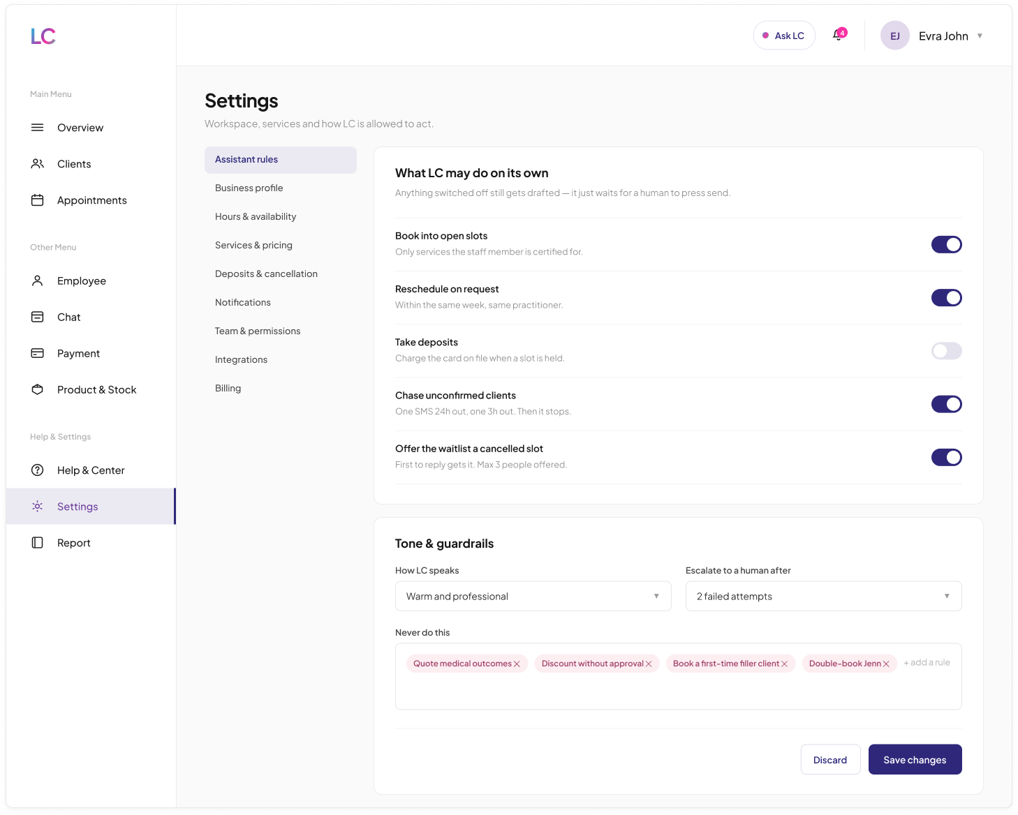
An AI assistant that can act autonomously on scheduling, payments or client communication is genuinely useful, but also genuinely risky if a clinic cannot see or control exactly what it is allowed to do.
I designed a dedicated Assistant rules panel where staff toggle specific autonomous actions individually: book into open slots, reschedule on request, take deposits, chase unconfirmed clients, offer the waitlist a cancelled slot. Alongside it sits an explicit Never do this guardrail list and a stated escalation point after two failed attempts.
Trust in an assistant does not come from it being capable. It comes from a business being able to see and set exactly where its autonomy ends. Naming specific, real risks in the guardrail list, rather than a generic disclaimer, shows the assistant was designed around actual failure modes a clinic would worry about.
The assistant went from an opaque automation feature to something a clinic owner could configure and trust deliberately, action by action.
Empty and error states that keep working
Empty states, no clients yet or an unbooked day, and error states such as a lost connection are often treated as dead ends: a blank message with nothing useful to do next.
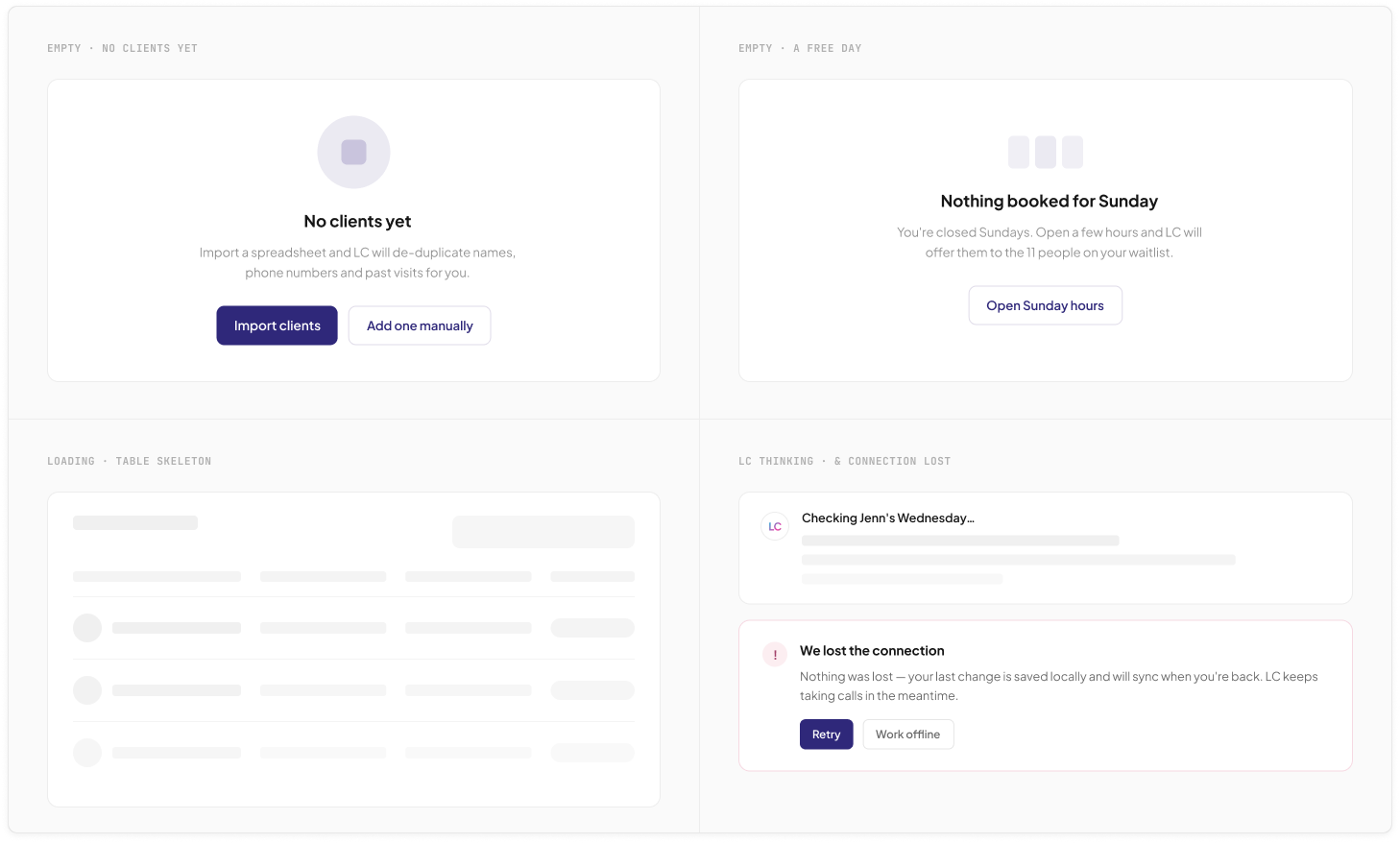
I designed empty states that propose a specific next action tied to real context, importing a client spreadsheet with automatic deduplication, or opening unused Sunday hours directly to the eleven people already on a waitlist. The connection-loss state explicitly confirms nothing was lost, changes will sync, and the clinic can keep working offline meanwhile.
A clinic running day-to-day operations cannot afford a dead end, whether that is an empty calendar or a lost connection. Turning both into a specific, actionable next step keeps the business moving instead of just informing them something is empty or broken.
Empty and error states became functional parts of the product instead of the parts that quietly did nothing.
Both sides, kept in step
As a solo project I designed every part of Lumina Clinic myself: the client app and the full business dashboard, including the assistant's permission model.
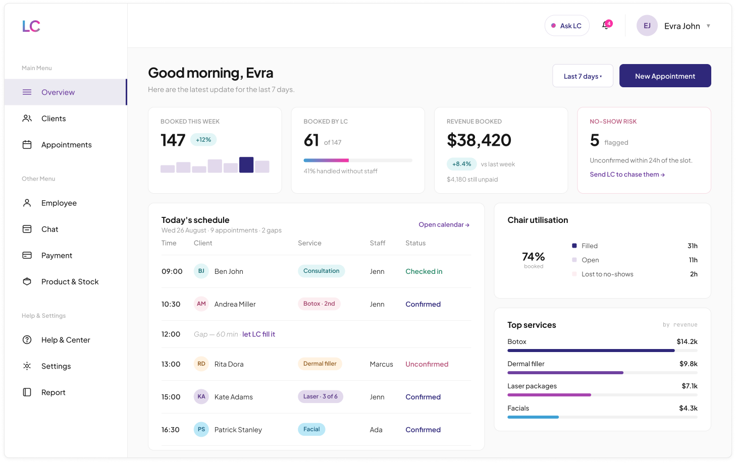
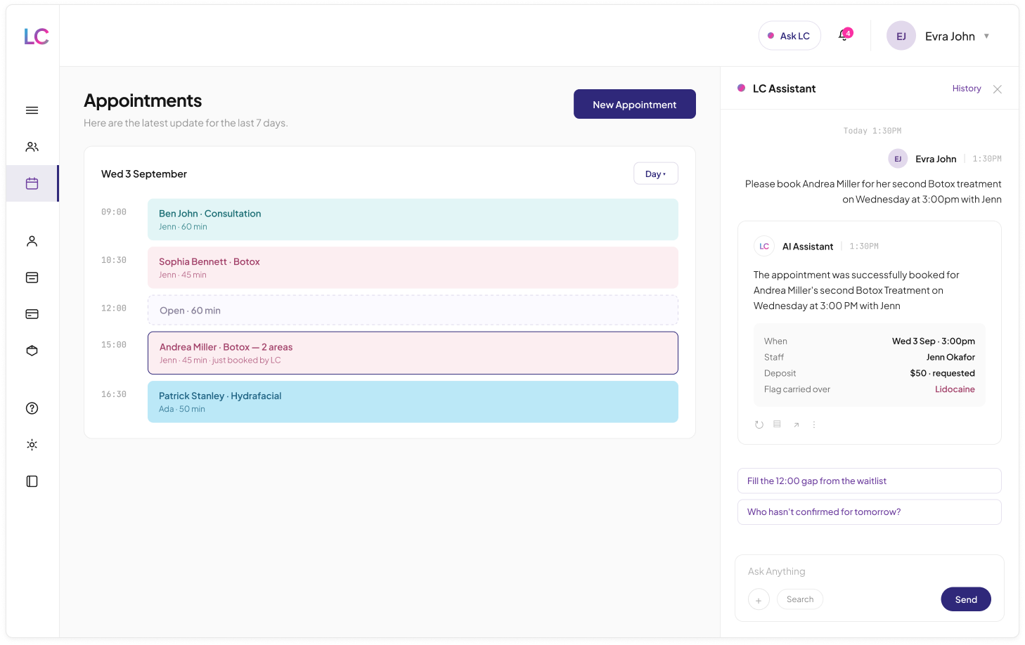
Keeping both sides consistent with each other was more direct to manage solo, since every client-facing feature could be checked against its business-side counterpart without coordinating across a handoff. The booking flow a client walks through is the same appointment a staff member creates in three steps from the calendar, and the flags and package credits on a client record are the same ones surfaced in the app.
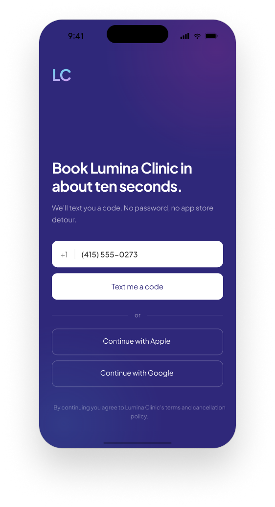
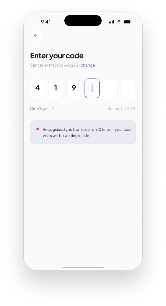
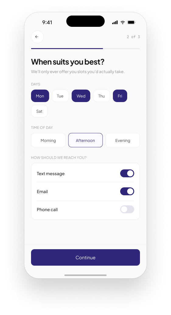
Sign-in, preferences, booking, day-of check-in, post-visit, payments, history, alerts, profile
Overview, calendar, client records, appointment creation, staff and certifications, payments, stock, reporting, help, settings
One appointment, one client record, one set of package credits and flags, read from both sides
In development
Lumina Clinic is currently in development. There is no public release yet, and no outcome or usage data to report at this stage. The evidence here is in the decisions themselves: what was combined, what was made secondary, what the assistant is not allowed to do, and why.
Two audiences that affect each other
The clearest idea shaping this project is that a booking platform's two audiences, the client and the clinic, are usually designed as if they do not affect each other, when in practice every gap on one side, an empty slot or an unconfirmed appointment, is a missed opportunity on the other, a waitlisted client or a lost booking. Designing both sides together, solo, made it possible to trace that connection directly instead of guessing at it across a handoff.
The assistant's permission model in particular came out of thinking about trust from the business's side first. A clinic will not hand over scheduling autonomy to something it cannot see or limit, so the guardrails needed to be as concrete and visible as the automation itself.